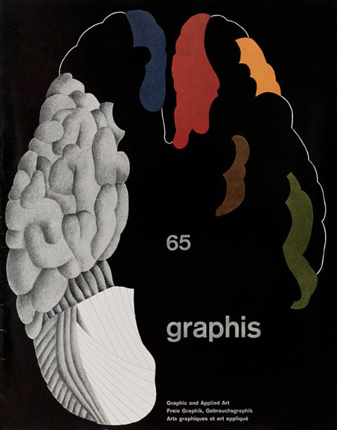
Geigy - an example of an integrated house style

Graphis’ vol.12, no.65, May/June 1956.
Today when the creation of vivid, current, socially communicative symbols has been neglected by the experimental fine artist, it falls increasingly to the graphic artist, working within modern technology, to perform this function. It is no longer sufficient—as it was for the pioneer designers—to move "good design" along the channels of the mass media, as if "good design" were a universal code. Today the creation of symbols seems more to the purpose of graphic design than the spread of formalistic standards. The symbols of many graphic artists, however, do not get beyond the status of trade-marks with a one-to-one reference to a product.
The artist is given the chance to create symbols of wider significance in the chemical industry, and in particular in pharmaceutical advertising. From the nature of the product hard selling would be out of place. There exists a specialized public which enables certain chemical firms both to advertise their products and give their advertisements a social function in addition to that of moving goods. J. R. Geigy has given its Art Director and his staff of designers the opportunity to situate its advertising in a context of vividly symbolized scientific relationships. With the cooperation of the scientific and selling departments the publicity department has created a polished style of communication of great authority.
In Geigy's prospectuses the designers handle a wide range of referents in a wide range of styles. In this range they can use, with the precision of a classical writer making allusions, a photograph of the new moon, an X-ray photograph of a jaw, a flat colour block of the bones of the hand, the inky footprints of a rat. In one booklet veins appear flowering in a flayed Renaissance anatomy and in diagramatic close-up as a great red highway. The cumulative effect of such resourceful abstraction is to symbolize aspects of the human body in relation to a scientific world-view. The "world of science" is presented in graphic symbols, without cliché.
The Geigy team of designers are as flexible in their decisions about the means to be used (photography, drawing, typography) as they are in breaking down their material into graphic form. This variety of presentation is unified not by an absolute standard of formal harmony of strictly conceived "good design" but by freshness and clarity of communication. The unity of the designs is the result of the clear transmission of messages, messages that include general orientation in a "world of science" as well as information about specific products.
It is in ways like this that the modern graphic artist is able to give to the public, or, at any rate, to sections of it, internationally legible symbols of the kind demanded by technology and which, on the whole, fine artists have failed to supply.
Lawrence Alloway
Magazine article in: Graphis’ vol.12, no.65, May/June 1956
