
Karl Gerstner Discussion 7
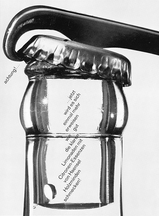
Haensel Holzminden. Advert. 1960
Karl Gerstner is a typographer, graphic designer and artist of considerable status and influence. Motivated by his belief in freedom and inspired by the inclusive philosophy of the Bauhaus, which proposed multi-disciplinary practice as an ideal, Gerstner's visual investigations have spanned the worlds of applied and fine art. Through his practice and writing, he has passionately advocated the concept of systems, most notably the grid, as a process of constructing meaning and aesthetic clarity. His precise, intricate and often complex structures originate in mathematical calculations and logic, but are utilised expressively and with aesthetic ingenuity.
Born in 1930 in Switzerland, Gerstner attended a preliminary course in art and design at the Allgemeine Gewerbeschule (1944-45), followed by a three-year apprenticeship in Studio Fritz Buhler; where he met Armin Hofmann. During this period he took complementary classes and was taught typesetting by Emil Ruder. Both Hofmann and Ruder were pioneers of the Basel School in graphic design, the principles of which Gerstner found highly influential.
After a short period working as designer in the Basel Ethnographic Museum, Gerstner became a freelance designer at Geigy pharmaceutical company (1949-53) and then established the Miro Basel design studio (1953-59), where his ambition was to adopt a broadly Bauhaus approach to design.
Gerstner developed connections with a wide-ranging group of artists and designers including Max Bill, Josef Albers, George Vantongerloo and the architect Alfred Roth, editor of the Swiss architectural and design journal Work. Gerstner proposed, designed and edited a special issue of the magazine on Swiss graphic art (1956). A year later he published the book Kalte Kunst? to promote an understanding of the Swiss post-constructivist school that advocated absolute purity and simplicity -and of which he considered himself to be a representative. In the same year he exhibited his paintings for the first time in Zurich.
In 1959 Gerstner founded the advertising agency Gerstner + Kutter with his Geigy colleague Markus Kutter. In the same year they published New Graphic Art, a seminal text surveying the history of the modern movement in graphic design. In 1963 Gerstner published the more theoretical cult volume Designing Programmes, advocating methodological approach to design and the use of 'integral typography' -analysis of text, image and hierarchy to inform the development and structure of ideas and layout. The book inspired MOMA's didactic show Think Program in 1973.
Architect and electronic music pioneer Paul Gredinger had joined Gerstner + Kutter in 1962 and the agency became Gerstner, Gredinger and Kutter (GGK) in 1963. GGK underwent an ambitious programme of expansion and took on an increasingly international client list that included large multinational companies such as IBM, Nestle, Volkswagen and Swissair. Gerstner left GGK as managing director in 1971 and concentrated on his work as an artist. He had had his first show in Paris in 1962 and regular exhibitions in New York, London, Caracas, Buenos Aires, Tokyo, Berlin, and Zurich have followed to the present day. In 1981 The Spirit of Colours, the Art of Karl Gerstner was published, followed in 1988 by Gerstner'a own book The Forms of Colours.
Gerstner's espousal of quality extends beyond the realm of graphic design to include quality of life, and in 1990 he published Karl Gerstner's Avant Garde Kuche, in which he adapted his methodology to the art of the kitchen. Most recently Gerstner published a review of his life's work in two volumes: Review of 5 x 10 Years of Graphic Design and Review of Seven Chapters of Constructive Pictures.
Although he retired from GGK as a director, Gerstner remained with the company as a freelance designer and undertook significant projects including the redesign of the Parisian newspaper Prance-Soir (1975), the iconic corporate identity for Swissair (1978) and in the 1980s, his consultancy and design for IBM. Gerstner happily accepted the commission to design the catalogue and advertising for the Kurt Schwitters exhibition at Centre Georges Pompidou in Paris (1994). The parallels between the two men played a part in persuading Gerstner to accept the job; both had founded advertising agencies, were passionate typographers and had successfully oscillated between art and design.
Art and design training / formative influences / breadth of vision
At the age of 14 - the cruel bloody war was still on - I had to take a decision about my future, which turned out to be a real stroke of luck as for one year I took an introductory art and design course at the Ailgemeine Gewerberschule in Basel. After that I was hired by Fritz Buhler for a three year apprenticeship in his advertising studio. There I met Armin Hofmann, a young designer responsible for 'strong graphics' - ideas expressed in his writing, typography and so on. Besides the practical work in Buhler's studio I was obliged to take complementary courses at the school, where I was instructed by Emil Ruder and learned typesetting - still in the lead epoch.
Hofmann and Ruder were a fruitful pair to whom I'm much obliged. They were leading in the avant-garde and became the main exponents of the Basel School. Hofmann was - and is - a great graphic designer and a teacher recognised worldwide. When he showed me how to design a letterform I learned much more than this. Ruder was a dedicated typographer, with a profound sense of general culture, and always placed his specialist knowledge in its historic context.
Above all Ruder transmitted his enthusiasm for the 'new typography' of the '20s and '30s, showing and explaining Tschichold's and Bauhaus' books. That was the basic orientation of my beginnings.
A few years later I learnt to appreciate the Zurich scene with - among others - Richard P. Lohse, Max Bill and the photo-pioneer Hans Finsler. These people were even closer to the Bauhaus tradition - Bill was a student of that school who laid the foundations for so many developments in modern design. Its criteria - concepts instead of decoration, ethical and aesthetic standards, truth to materials - are valid in every creative field. No wonder that Bill was active as an architect, industrial designer, sculptor, painter, typographer and advertising designer - and also an effective politician and theorist. My goal was more modest. I wanted to become a general communication designer and a picture-maker. This double activity, using similar elements for different impact, lasted all my life: making everyday things like works of art and works of art like everyday things. When my apprenticeship ended I took a modest but highly interesting job in the Basel Museum of Ethnology: redesigning the prehistoric section. Then, in 1949, Max Schmid, an old tutor of the Buhler time, asked me to join him as a freelance designer working for Geigy chemicals, where he had ended up as a one-man design department.
Post-war optimism / politics / the legacy of the war
Of course I was as happy as everyone else in Switzerland that my country wasn't overrun by Nazis. It would have been a catastrophe, especially for my native city Basel on the border of Germany and occupied France.
Switzerland was mentally reasonably prepared to resist Nazi ideology. In 1939, just before the war, there was a great effort made to organise a national exhibition. This enforced the Swiss identity and helped to strengthen national unity, raising confidence and self-assurance. The end of the war brought not only happiness but also shock when all the Nazi crimes came to light. It's no wonder that this awareness produced a great deal of idealism, among young people in particular. I was 15 and also wanted to contribute enthusiastically towards building a more humane world.
But progressive ideas were not much in demand. The precious coin of the national exhibition showed its less positive side. Switzerland's self-image had become too cosy and nostalgic with a focus on sentimental things that encouraged a kind of protectionist conservatism. Another unexpected threat showed up in the east - communism. Didn't Stalin forbid progressive artists in the same way Hitler did - Kandinsky, Malevich, El Lissitzky and so on?
The post-war years were in many ways very troubling - the cold war followed for decades-and yet the battle for freedom and acceptance also had a positive side: when you fight against something, you sharpen your criteria.
Enduring approaches / systematic thinking
These early years were formative. Looking back I can see a clear development from the beginning, but it didn't feel like that at the time. Ina relatively short time I had established the basic principles of my future work as a typographer and graphic designer. But constantly I was broadening my experience. For instance I developed the Bauhaus concept of the grid, making grids that were less rigid and more flexible to adapt to the needs of the job.
My typography has always been strictly related to the purpose, to the content. It was never formalistic. I always felt most comfortable when I was not only the typographer but also the author. My book of 1957, Kalte Kunst?, is the first where I conceived the content and design in conjunction. It is split into three parts - history, present and future - each On a different coloured paper. The historical part is divided horizontally into copy and illustrations, and every spread is related by theme and so on. There is unity, which makes the content as clear as possible for the reader.
Or have a look at the book of Markus Kutter's writings Leser gesucht für das Werk der Zukunft also titled Gebrauchsanweisung für die Zukunft des Werks. Maybe it's the only book that not only has two titles but also two beginnings and no end. It seems very free, but is based on a strong, but variable grid.
Whatever I'm doing applies conclusions arrived at through logic - in typography as well as in pictures. If someone asks me where the emotion resides I like to make a comparison with music. If you play a scale on a piano and hear a dissonance, you can be sure the interval between notes hasn't the right oscillations. This can be expressed in numbers. Numbers are inherent to perception, even if there is no dissonance. I call it precision of perception.
Advertising / Ford / embracing change / remaining small
Apropos Markus Kutter - historian, PR manager and avant-garde novelist - at this time we had a free and inspiring relationship, which in 1959 led us to found the advertising agency Gerstner + Kutter, without knowing anything about advertising.
In this period advertising had a rather bad reputation - above all in Switzerland - and for good reason. In spite of that, or perhaps because of it, I was interested in this new field of activity. Here was something to improve and I was fascinated by these two arts coming together, the visual and the textual. Also I had seen examples from the USA, especially from the early DDB, which convinced me that advertising had indeed the prerequisites of a true art. In the beginning graphic design and typography had been the most crucial elements in our work, but after a short time something became more important: the generation of ideas. To implement our ideas properly we were more or less obliged to found a photographic department and later even a movie studio. We really wanted to penetrate the whole creative domain and dreamt of becoming a sort of Bauhaus, but as a business, not as a school. In the pursuit of this aim we planned to add an industrial design branch and so we hired an architect - he'd never built a house but was - and is - a pioneer of electronic music. He is one of the most unconventional and thus creative spirits I've ever met Paul Gredinger, who became the second G of our new name GGK.
In a relatively short space of time the company had grown and was expanding into other countries. The first GGK abroad was in Dusseldorf, where at that time our biggest account by far was with the Ford company.
Ford Germany was, in 1967, in serious trouble and the management had asked permission from Detroit to change agency from JW Thompson - who served Ford worldwide - to our small Swiss agency that nobody there had heard of. After two yeses of internal fighting the German board who engaged us was changed and we were fired with it. Of course for GGK it was a catastrophe, but still it was a challenging experience.
For me it was the right moment to quit. The bigger GGK grew, the more I transmuted from a designer to a manager - not my hottest vocation. I handed over the business to Gredinger who shaped GGK Dusseldorf into one of the most creative teams. I was happy to have more time for my pictures and continued to make graphic design, but only for projects that I could do on my own.
Affinity with clients / making good work / compromise / confidence
The essential basis for cooperation is trust. Mutual respect and understanding make the process easier and more fertile. The smaller the client the more feasible this is. One of our first clients was a German office furniture producer who was not only the owner but also the sales manager responsible for the marketing and advertising budget. Our pleasant partnership lasted for decades. It is a different thing with the big shots. Too many people are invited to express their precious opinions - not so much to improve the advertising concepts, but to demonstrate their unique wisdom.
It's a different situation when you are developing a corporate identity. It's necessary to deal with a number of panels because the top executives are the ones who will have to get behind the new identity.
In the case of Swissair I chose to convince them step by step. Firstly I wanted to get an agreement on my logo proposal. I argued for a typeset logo, instead of the existing drawn logo, and presented a number of alternatives. When the choice was made everybody thought the decision was their own. Secondly I considered the symbol, a more difficult task because the staff loved the old 'arrow living' they'd grown accustomed to over many years.
The breakthrough came when I proposed rejecting any symbol and replacing it with our national emblem the Swiss cross - which was already used and visually dominated their planes. That was the solution: the Swiss cross in a kind of rhomboid that made a reference to the plane's rudder. This communicated the typical Swiss characteristics of reliability and punctuality much more strongly.
Everybody was excited and the arrow wing was forgotten immediately. Of course there are always accidents and you are defenceless against them. For instance I wanted to paint the planes a glossy dark umbra. The models I presented looked terrific and a large majority opted for this design. But a tiny group was furiously opposed. Some-one came up with the argument that the Allegheny Airline once had black planes, called 'flying coffins' by the public. Nobody else had heard of this, but my proposal was dead at once. The fear that this could also happen to Swissair was too great regardless of the validity of the argument.
Am I confident? What should I see I always had conviction about my work. That helped me to convince others - without luxurious presentations. Maybe I tried more than designers usually do to develop and communicate the rationale for what I did. I never just said how beautiful something was, I always convinced clients using reason. If I made a mistake - and it happened - I didn't argue but just accepted that something went wrong and went back to work.
Graphic design is s matter of solving problems, art is a matter of inventing problems.
Graphic design is as important a task as one makes it. Everything can be done consciously and seriously - or not. I confess I'm confused when I look at recent developments. I see the predominance of big brands taking the decisions away from consumers. People are encouraged to buy the latest of everything. Only if they do can they feel integrated into the current social context. Evidently advertising - including graphic, design - plays a leading role in this game.
Life has become short-term. If someone creates a new hairstyle I have to hurry to adopt it. If a new mobile phone is introduced I have to have it the next day. I observe this from a distance and I'm worried that it will result in horrendous superficiality. I guess I'm too old to have an objective understanding of this fundamental change in social behaviour. For as long as I remember, I've bought as though it were to last a lifetime, after careful consideration - even clothes.
Of course I'm not blind to the fundamental connections between consumer and producer. There are more people studying and inventing and producing things and somehow the two sides manage to create a kind of equilibrium. I don't know how, it's a wonder to me, but this makes me hopeful that also the art of graphic design - and art itself will have a fair future.
Being part of graphic design and net history / changing perceptions of worth
Becoming part of history - great ambition in whatever field. Before I guess what the future may bring I'm very busy with the present. Every morning when I wake up I feel how much it is unbelievable chance that I was born and am still alive. There is an obligation to make the best of my existence.
It is true that I have had some recognition as a graphic designer and as an artist. I'm not so ambitious to become famous, but I'm ambitious to make respectable work in both graphic design and picture-making. That's my satisfaction. Of course I'm proud to see my pictures in collections and museums, but this is also a relative pleasure. How many artists have I witnessed at the summit of a splendid career, and how many of them are now totally forgotten, their pictures somewhere in a dark stockroom? Twenty or 30 years later a few of them are rediscovered - and that's how things go on. It's a long, long journey to get a place in history.
Teaching
I only taught for one year, 1955, when I replaced Armin Hofmann who had been offered a chair at Yale. It was just long enough to become aware that teaching was not my gift. I'm very impatient with myself as well as with others - a bad attitude for a professor. In my defence I mention some of my books - among others Designing Programmes and Compendium for Literates - which were quite often useful as educational material.
Excerpt from Drip-dry Shirts: the Evolution of the Graphic Designer
Lucienne Roberts 2005