
Karl Gerstner
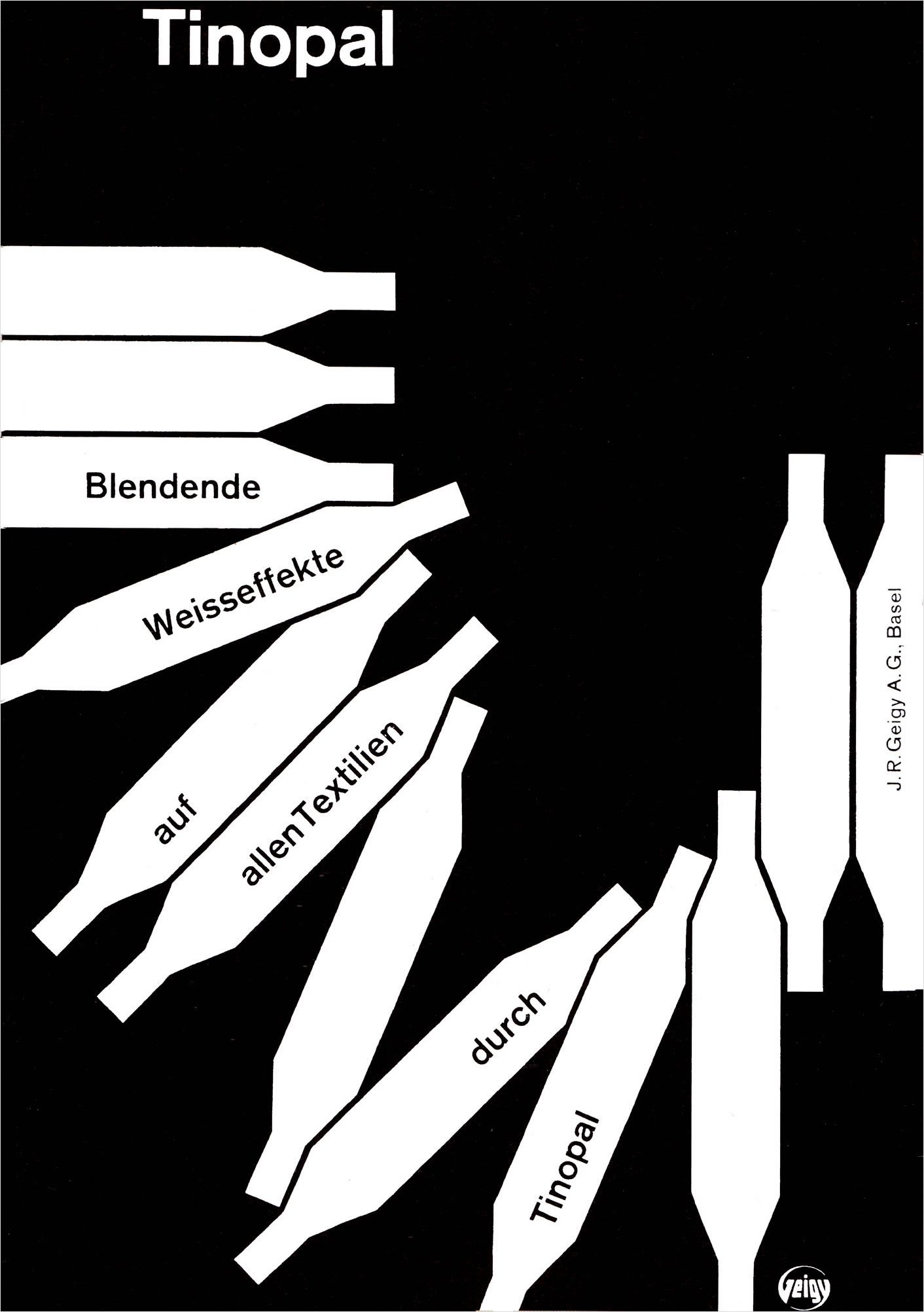
Tinopal Geigy. Advert. 1957.
When I was twenty, I set up on my own—with the aim of putting into practice, to the best of my ability, the Bauhaus philosophy of the unity of culture. As a graphic designer, I thought to design things of everyday life like works of art; and as a picture-maker, I thought to design works of art like things of everyday life. Soon after, I established my own office. My objective was to realise my dream, i.e., to found a kind of Bauhaus—not as a school, but as a commercial agency for all kinds of creative tasks, from the visiting card to city planning. This agency, "Bureau Basel," was intended to bring together a team of designers, architects, photographers, sociologists, psychologists, writers, musicians, and so on. All of them were full of ideas and ready to resolve problems in interdisciplinary cooperation. But the dream remained a dream; the Bureau Basel never worked as it should have.
After that common experience, Markus Kutter and I decided to found a conventional advertising agency—with unconventional work, because neither of us understood anything about advertising. Thus, in 1959, Gerstner Kutter was founded in Basel, and I concentrated my energy on building up this enterprise. As a consequence of our ignorance, we were obliged to develop our own ideas and principles, which turned out to be the basis of the future success of the agency.
About ten years later, when I was forty, I retired from the agency, for I had realised that the Bauhaus philosophy led to many contradictions. I also wanted to concentrate on what has always been close to my heart: doing nothing, having time, making pictures. What I didn't know at that time was that I was starting on another—rather unexpected—career; as a typographic designer for printed media. I conceived concepts for several monthly, weekly, and daily papers, and these tasks in the communication business gave me much satisfaction. As both a designer and a picture-maker, I have always accompanied my work with theoretical reflections and research, and I have written several articles and books exploring the efficiency of creative processes. This inquiry led to my summarising formula, "Instead of solutions of problems, programs for solutions."
Today, the process of writing has become increasingly complex, as it combines both science and art, which have spawned a variety of scientific branches as well as art forms. Typography is one of the remarkable results of this combination, and its scientific and artistic connections are still being debated.
In 1959, Karl Gerstner formed an advertising agency in Switzerland and began his investigations into typography, language, and writing. The results have included a series of publications—Kalte Kunste? (1957), Designing Programmes (1963), Typographical Memorandum (1972) and Compendium for Literates (1970)—and a 1973 exhibition at the Museum of Modem Art in New York; the latter, titled Think Program, included material based on these publications and reinforced his theories on systematising (programming) the problem-solving process.
In all of these endeavours, typography was viewed as a scientific as well as artistic phenomenon. Gerstner classified typography by separating it into categories—for instance, typography as language, as image, as field, or as sequence. This enabled the reader to see how language and writing changed once they were transformed into type. For example, typography can transform language or writing into a visual idea. Words and sentences can be visually manipulated so that verbal meaning is enhanced. By a simple distortion of a letter or word, the viewer can be presented with a visual pun.
Gerstner further acknowledges that type alone is an inadequate form of communication. Visual materials such as photographs, drawings, and diagrams support the copy and can make possible its reduction. However, to the proverbial picture that's worth a thousand words, Gerstner retorts that "the text could not be replaced by a thousand pictures."
The subject of space and time is an important one in typography. How long it takes to speak a line or a paragraph is identical to the amount of space required to print it. Thus, a designer must consider spatial organisation and type selection, just as a speaker is concerned with speech patterns and briefings. For the designer, the use of a highly developed grid can provide all the flexibility and freedom to arrange and organise typography and other visual material.
Finally, the limitation of space in typography can be solved and expanded by the use of a series of spaces or pages. This process involves the development of a sequence which can be a creative force in design, particularly book design. Though each page is new and different, a sense of similarity and uniformity is sought and maintained. These summary observations culminated in the publication of Gerstner's Compendium in 1972. Though he no longer practices advertising, his outlook is sufficiently wide-ranging to afford him the luxury of pursuing varied forms of creativity. Since 1970, he has been applying these concepts to other art forms, particularly painting and constructions.
—D. Ichiyama