
Swissair

Original Swissair Identity [fig. 1]
Swissair logo Futura bold [fig. 2]
Preliminary logo [fig. 3]
Preliminary logo [fig. 4]
Preliminary logo [fig. 5]
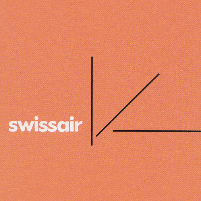
"Swiss direction" preliminary logo [fig. 6]
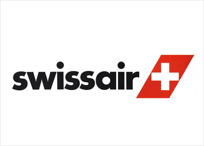
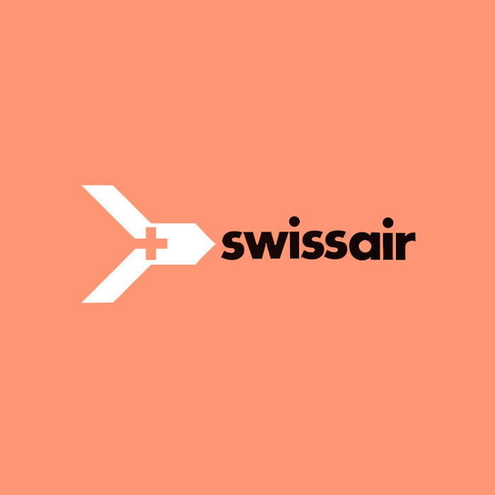
Final logo Swissair [fig. 7]
Preliminary color design [fig. 8]
In '78 GGK had already been working for Swissair for twelve years. Our collaboration was close, almost friendly, and was to continue being so for a long time. Independent of the agency, I was commissioned to offer a proposal for painting new airplanes.
This is the story: in the near future Swissair, as the first airline in the world, was expecting a new type of airplane, one which made less noise and was easy on the environment. It satisfied demands which had already been proclaimed loudly, but had naturally not yet been met voluntarily by anyone. The president of Swissair, Armin Baltensweiler, originally an aeronautical engineer himself, did not want to wait until the problems dictated what had to be done.
That is why he, in his capacity as expert and customer, pressed his supplier, the giant McDonnell Douglas, to develop in the name of Swissair a new kind of aircraft which would satisfy the emerging demands This airplane was the DC-980.
As revolutionary as the new type was, it was annoying that it hardly differed in appearance from its predecessor. The plane was extremely elegant with a considerably lengthened fuselage – but who would notice that other than those who already knew anyway? This was the reasoning behind calling the attention of the public at large to the change by means of a new painted exterior.
To a great extent it is the appearance of the airplanes that determines the image of the airline. When you change the appearance, you are automatically changing something in the corporate identity. That is why I proposed not starting with the painted exterior but with the corporate identity, and then transferring it to the airplanes. I had no problem convincing the president of the logic of this roundabout way. If only he had been an absolute ruler!
Unfortunately he wasn't. Everybody had a say: advertising and marketing, service and maintenance, engineering and servicing, buying and selling, and of course finance and the board of trustees. And all of them were still more or less attached to their existing identity [fig 1]: solid Swiss graphic design of the fifties which had at one time been considered progressive. That was the starting position.
Anybody who is designing identity has to take as his starting point the fact that his patron has to identify with it. The larger the business is, the more difficult it is to achieve this. And it is even more difficult in companies where all decisions are made by consensus.
It didn't matter how good the reasons were for changing the identity – the resistance was huge. So not only did the proposals have to be convincing, but even the work of convincing itself. Designing the identity – the actual creative work – is less difficult than acquainting the patron with his new image, not just in the case of Swissair.
The first meeting consisted of confronting the long-familiar Swissair image with the images of the most important competitors. The purpose of this was not to draw binding criteria for the company's own goals – that would have been too ambitious. Besides, there was a danger that we might commit ourselves too early. The purpose was to have a discussion so that we could get to the point.
I decided not to take my partners by surprise with a completely finished solution, but to instead propose options for solutions To this end I would proceed step by step, following the three classical elements of identity: logo, label, and color.
I first dealt with the logo, which I considered the easier element, by stating the premise, following a basic proven truth, that it should not be drawn like the one used up to that point, but set in type.
The reason was that if the logo were drawn, it would become a second symbol next to the symbol; in other words, they would be competing; in any case. it would be an additional element, which would have to be fit in everywhere. If, on the other hand, the logo were set in type, then this could be used as the company typeface. And this would obviously create more consistency and strengthen the corporate identity.
Moving from the drawn logo to the typeset one is in any case a categorical step. But in order to go about applying my premise carefully, I first put up for discussion the type which is closest To the old logo: Univers by Adrian Frutiger.
A comment of fundamental importance:
SWISSAIR
is first of all a word-image. And as such, composed of its letters, it is as unique as any word-image. It is unique due to the combination of letters, and their relationship to each other in a rhythm of straight, diagonal, and rounded elements.
Regardless of the typeface, Swissair is always read as “Swissair." But something new is added each time: the elegance, a word-image's direct expression of character which is independent of content, function, and readability. It is a psychological matter and of central importance to the logo – but also a playground for pompous asses and charlatans.
I have often worked with Peter Hofstatter's so-called "polarity profile" and always had good results. It works with different degrees of opposite characteristics, such as
clear…….unclear
progressive…….conservative
hard…….gentle
elegant…….commonplace
original…….unoriginal
clear…….unclear
exciting…….boring
and so on. These points are checked by about twenty-four test persons, and the average gives a profile which clearly reveals if the effect corresponds with the expectation. This method of quantitative psychology is easy to use and gives results which are objectively understandable. Hofstatter explains this in greater depth in his book entitled Gruppendynamik (Group dynamics).
In the polarity profile the presentation of SWISSAIR in Univers was considered quite clear, but unoriginal. We subsequently tried out all usual sans serif typefaces until a preliminary decision was made in favor of Futura. It should be noted that this decision had nothing to do with aesthetic quality, but solely with elegance, while keeping the desired goal in mind. Futura was appreciated for its obstinacy, character, and power.
SWISSAIR set in Futura was already quite far from the drawn logo. But after the gradual differences of the different sans serifs it seemed appropriate to bring a categorical difference into the discussion.
Futura and Times have totally different effects, which is exactly what makes the discussion useful. Which one is more likely to win you over: the conservative and civil antiqua or the objective and progressive sans serif? In terms of aesthetics they are more or less equals; as a designer I can live with both of them.
Comparing the word-images was like a game, and the managers clearly enjoyed it. And it had a positive influence on the type-laymen. Since they considered themselves progressive, they chose sans serif for the continuing work.
For the sake of completeness I presented formal variations: medium light, medium black; and then compact with expanded spacing, compact with condensed spacing, and italics. And finally, the most drastic break I made with the past was to move away from the ceremonial stiff capitals and towards lively lowercase letters. To my surprise, nobody was shocked, which gave me the courage to write everything small. The elegance of this type communicates liveliness, modernity, originality, and self-confidence. But most important is that it holds its own even in competition with all the other logos.
At the end of the run-through of the logos something happened that rarely happens: the management – the majority of which had not wanted to change a thing – blessed my proposal in unison, if not enthusiastically, yet the logo could not be any more different from the old one – nor could it speak any more convincingly for itself.
So the company typeface had been found in Futura bold,[fig 2] and the premise was taken care of. It was used from this point on for all printed matter (at least those of a certain size or larger, something I will come back to).
My way of approaching the new Swissair logo reflects my discursive working method. I also love to improvise, which means that I free myself of all obligations which automatically accompany a job. I bring ideas to paper so to say "with limited liability," meaning without thinking about usability in the least.
It is rare that a project invites you to dream as much as the subject of Swissair and flying. It is a unique experience for me every time when it is gray and rainy at Kloten Airport in Zurich – which is often the case – and then the airplane flies above the clouds and you can see the Alps in blazing sunshine. That is the very personal image that I associate with Swissair.
Here I have taken a sporty image which is fitting for airline.[fig 3] The three lines stand for the Olympic motto altius, rapidius, longius: higher, faster farther. This is the way I search for something I can present.
The three basic elements of a modern corporate identity – logo, symbol, and color – are a practicable norm, but not a requirement.
As a challenge for reducing the number to two, I have tried to meld logo and label into a typoprogram. That is a word-image which doesn’t just say its name, but also represents it: “up, up, and away” like the slogan of an American airline which long ago became a part of advertising history.
In spite of all the enthusiasm for something new which was released by my breakthrough with the logo, the color red was never an issue. But I chose a pure, warm red cinnabar instead of the mixed and cold tone – a standard color called fire department red – which had been used until then.
The new color, seemingly only a nuance different than the old color, which nobody had questioned – and which many hadn’t even noticed – was very effective, especially at airports, where the large surface of the airplane tail seemed more active and modern in cinnabar red.
The next step was the label. A solution as elegant as the one for the logo was not possible, even though there was unanimity on the fact that the new logo no longer fit the old winged arrow. It would have been natural to retain the winged arrow motif by updating the form to recreate a stylistic unity. [fig 4]
All of those involved would have been able to live with this solution. But arrow symbols – in spite of their formal quality – have one problem: they point in one direction, and this is often the wrong one. I looked further into the matter and made a banal but spectacular discovery: Swissair didn't even need a new label.
Up until that point Swissair did not just operate with the winged arrow label, but also had a second label which strangely enough had not established itself within the company as a label. The small winged arrow was displayed in front on the nose of the airplane, while behind on the tail there was a large, Swiss cross; not only was it more visible, but it was also better known throughout the world.
Moreover, it conveyed an image which could, in turn, be transferred to Swissair: dependability, security, and courtesy. This realization was conclusive. From then on the subject of the winged arrow was forgotten.
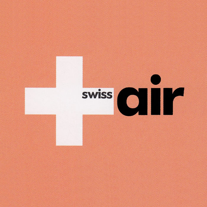
The solution for the label of the new identity could only be found in connection with the Swiss national emblem. There was no way that anyone could oppose including the Swiss cross in the logo. Even though the most obvious thing is often the best, in this case the result is hopelessly ordinary.
In contrast, the following designs are not just daring, they are playful; I presented them without hope of their acceptance. But I did like them. [fig 5]
The work of a designer is more craft than art. And as we all know, the muse is a fickle partner, kissing when and whom she wants. Inspiration can't be forced; either you have it or you don't. Or it comes too late.
That is the stressful situation which every designer knows. If he has found it, he is rewarded by a surge of happiness which makes up for even for a big effort. That's the way it was for me, at least when I got the idea for "Swiss direction."
I started with the Swiss cross and drew diagonals at the intersection of the two beams. This resulted in four identical legs which I could flip outwards so that they point towards the four points of the compass: radiating from tiny Switzerland towards the whole world. That is the "Swiss direction."[fig 6] Could there possibly be a more convincing symbol for our airline?
I particularly envisaged the new symbol in a moving medium, in film and television. Here the idea of opening up could be shown to the audience in slow motion, and the static or printed version would thus involuntarily remind them of the moving image.
To my surprise only a few of the Swissair partners shared my enthusiasm. The proposal was rejected as "too sophisticated." The worst part about it is that when I search for the cause objectively, I find that I myself was responsible for the disaster. I was so sure of myself that I made the frightful mistake of presenting my kinetic idea on paper, thus overtaxing the imaginative ability of my clients. If only I had taken the risk and presented my idea as a film – with music – the decision would have been very different. If only...
The symbol that ended up being accepted was taken directly from the airplanes: I stylized the tail, which has always carried a Swiss cross, into a rhomboid form. [fig 7]
My decision to propose options for solutions instead of definitive solutions inevitably brought me into conflict with myself. That was the risk I took when I gave "Swiss direction" precedence. But I had to accept the decision. As in the case of the logo, I worked a lot with the label, but actually did very little. In both cases the solution basically presented itself.
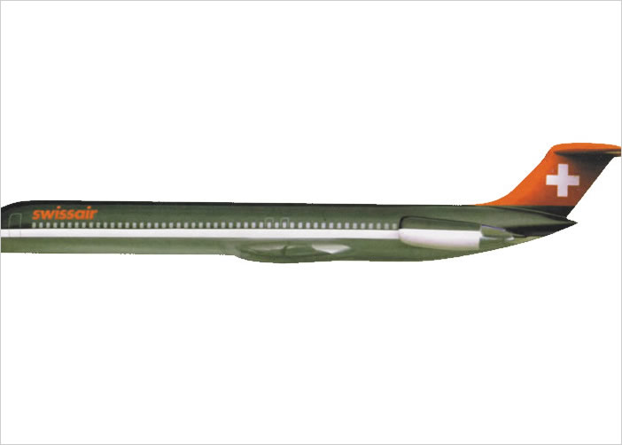
At the very end I approached the design of the airplanes, which was actually what I had been hired to do. It was my intention to complete the job, and my proposal – seen here as a model flying over the Alps [fig 8] – was accepted by the majority.
My proposal did not get past the model stage, however, due to the fact that, more than anything else, the new design of the airplanes aroused unexpected passion. My design was stubbornly rejected by a minority of the decision-making committee. They put forward all sorts of specialized arguments, such as that the dark roof would accumulate too much heat during servicing in Africa. Objections like this certainly have to be taken into consideration, but they can all be refuted.
Due to the polarity of opinion, my supporters increasingly showed their solidarity for my design. They felt that it reflected their ideas, showed the elegance of the new airplane in the correct light, and captured the serious and modern image of Swissair in the best way. But my opponents did not give up.
What finally toppled my design was the lesson taught by the argument which somebody threw into the debate: Allegheny Airlines once had a black airplane, and people had called it "the flying coffin.”
Nobody there had ever heard of it, but the dismay was instantaneous – and could not be alleviated. I still don't know If there is any truth in this story, but even somebody who doubted it would not want the beautiful new DC-980 to be given the same nickname.
Even the comment that the color was not black, but dark bronze metallic did not change anything. And as always, the upper part of the airplanes was painted white.
When a job is done, we usually begin making the manual – also called the 3M, or "money-making machine." I am not one to put everything down in great detail beforehand like a book-keeper, and this was especially the case with the Swissair project, where thousands of objects had to be taken into consideration and new ones were constantly being added.
I limited myself to the conceptual work, and then passed the baton on to competent graphic design studios. I set a minimum of guidelines which are the foundation for continued use – and which have to be strictly followed. So Swissair was a stroke of luck, because they have their own first-class professionals, whom I can trust in every way and who independently master every new task they are given.
My guidelines consisted of twelve points of which the most important are documented here. I have already mentioned one point: the use of Futura bold. As suitable as it is for display type, it is bad for copy and thus has to be complemented by another typeface. The choice was Times, which is not only a complement, but also a rich contrast: all copy up to twelve-point was to be set in Times, and everything larger was set in Futura bold.
This brochure was distributed in great numbers to employees – even to those who have nothing to do with using identity, to every person in the wide world who works for Swissair, as well as to partners and friends of Swissair. People were to be made familiar with the new identity – a major turning point for the firm – and they were also to learn of all the reasons behind it.