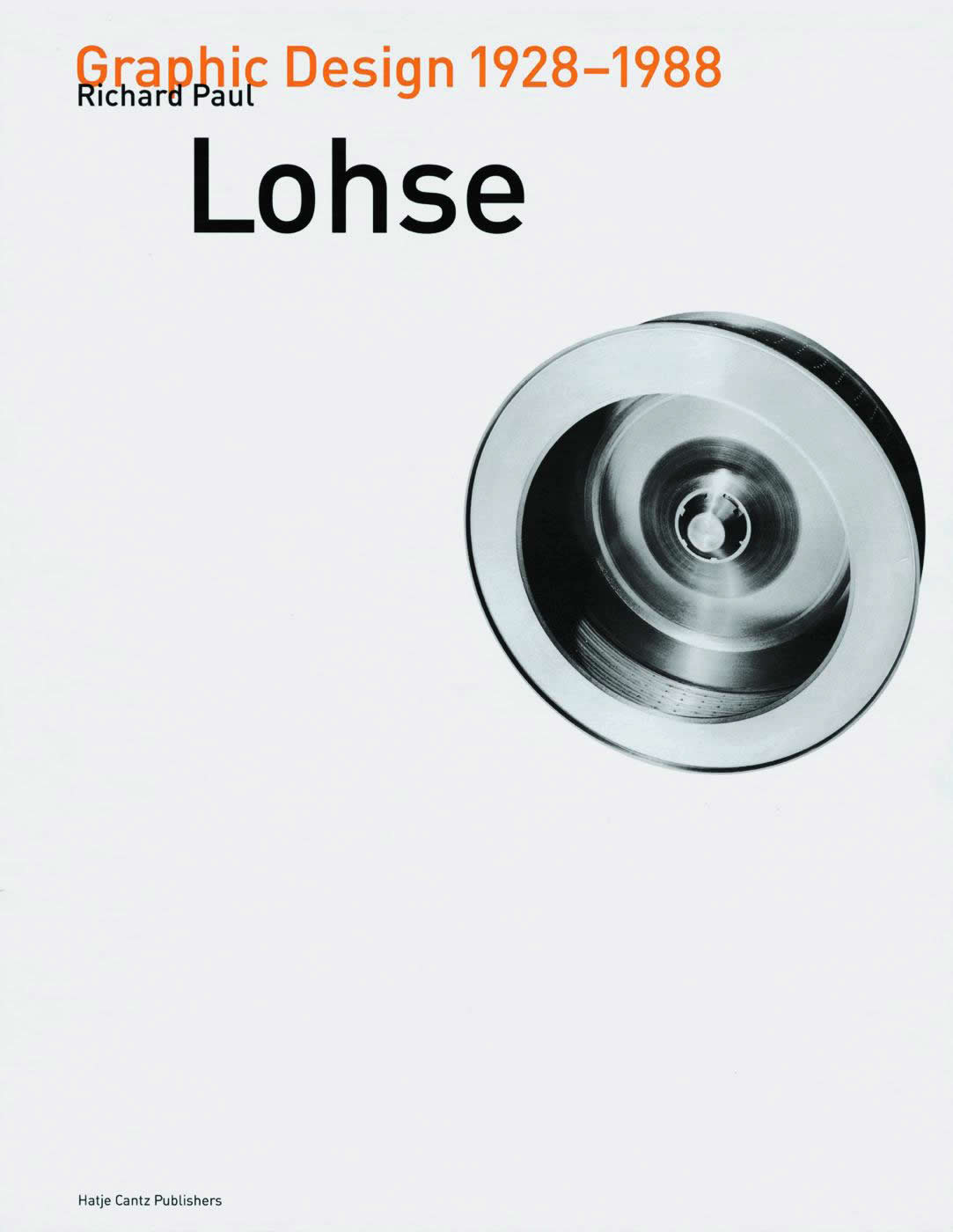
Richard Paul Lohse Graphic Design 1928–1988

Konstruktive Gebrauchsgraphik Richard Paul Lohse 1928-1988. English translation of German text in a separate volume. Ostfildern-Ruit: Hatje Cantz Verlag, 1999.
The conventional narrative of Swiss design goes something like this. Swiss designers in the 1950s sought to differentiate their work from that of artists. They created a rational style that was dictated by the constraints of a formal grid, limited by a narrow range of sans serif typefaces and biased towards the objectivity of the photograph rather than the subjectivity of the drawing. Philip Meggs writes: 'Personal expression and eccentric solutions were rejected, while a more universal and scientific approach to design problem solving was embraced ... Achieving clarity and order is the ideal." This purported striving for objectivity, so the narrative goes, lasted until the 1960s when the bad boy of Swiss typography, Wolfgang Weingart, challenged the restrictions propounded by his teachers at the Basel Kunstgewerbeschule, and began to experiment with more informal layouts, unusual letter spacing, and the mingling of new expressive shapes and letterforms. Weingart was the son slaying the father and he opened the way for several generations of young designers from many countries to adopt elements from the Swiss typographic model but on their own postmodern terms.
The problem with this story is that it tends to flatten out the rich contours of the Swiss movement, thus depriving succeeding generations of a greater awareness of how varied the work of Swiss designers has been and how different these designers are from each other. Fortunately, a number of thick monographs on individual designers have appeared in recent years and these have begun to challenge the earlier narrative. First, these books enable us to encounter the designers as much fuller human beings than we have previously known them to be. Second, we can see a wide array of their work and get a sense of its variety in a way that was not possible before. And third, we can begin to understand how their individual characteristics both contribute to a larger movement and also distinguish them as designers with distinct professional approaches.
The volume on Lohse was initiated by the Richard Paul Lohse Foundation, which spared no expense in its production. It is a large, ambitious book with many illustrations that cover every aspect of Lohse's graphic design career. The principal work is in German but there is also a small companion volume with English translations. One value of a critical book that features authors with differing perspectives is that the public gets a much richer interpretation of a designer's work, one that may well challenge the designer's own narrative of what he or she has done. Lohse is particularly well served in this sense—in fact, better served than in just about any monograph on a graphic designer that I have seen.
The lead text by Hans Heinz Holz links Lohse's formal characteristics to a larger rational scientific world view and Holz argues that the strict order of Lohse's individual designs symbolically represents his belief in the way the world itself is ordered. 'He [Lohse] was thus able to draw an analogy between his principles of construction and the political principle of democracy,' writes Holz.
Jorg Stfirzebecher, a German graphic design historian and critic whose writings deserve to be better known in English, writes more specifically about Lohse's leftist politics and how they determined the kinds of commissions he undertook. Stfirzebecher draws a valid comparison, for example, between John Heartfield's photo-montage book covers for the Malik Verlag in the 1920s and Lohse's for the Jean Christophe-Verlag and the Buchergilde Gutenberg in the 1930s and 1940s. Lohse learned his craft, as Christoph Bignens recounts, at the Max Dalang Advertising Agency, one of the first agencies in Switzerland, and among the most conceptually aggressive. Other essays by Bela Stetzer and Michael Lenz focus respectively on Lohse's art direction for the magazine Bauen + Wohnen and his editorial contributions to the Swiss design magazine Neue Graphik.
From the five essays, the reader garners a richly textured profile of Lohse that positions his design activity within his fundamental way of engaging the world. Lohse's work has much in common with that of Jan Tschichold and Piet Zwart, although he is more consistently committed to making his design practice an example of his strong belief in a liberal political order than he is to using it to reinforce his engagement with the establishment of modern architecture in Switzerland. Swiss designers like Emil Ruder, Armin Hoffman, Josef Muller-Brockmann and Gerstner are far better known than Lohse but, as this book demonstrates, Lohse was an indispensable bridge between the 'new typography' of the 1920s and the Swiss movement that followed.
Victor Margolin
