
Teaching Sensitivity to Type
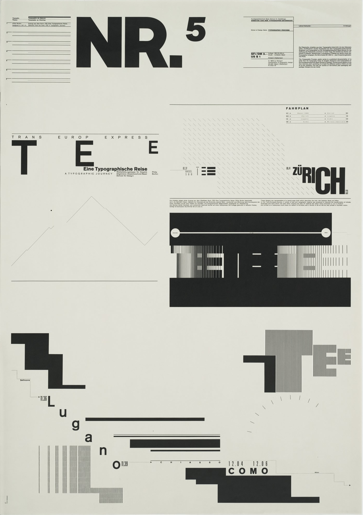
Typographic Process, Nr 5. Typography as (Painting) 1971-1974.
Design pioneer Wolfgang Weingart discusses how typography is taught at the Basel School of Design in Switzerland.
Wolfgang Weingart has been challenging the accepted conventions in typography since 1968' when he began teaching at the Basel School of Design, an institution with an international reputation for its design program. But as a student at the school in the mid-1960s, Weingart found the typography course too dogmatic and quickly dropped it. Recognizing his potential, his instructors, Emil Ruder and Armin Hofmann, allowed him to work on his own and eventually offered him a teaching position in the advanced program for foreigners, where he still teaches today.
Immediately, Weingart set out to free himself and his students from the strict conventions of the Swiss school, which he sensed had come to the end of its dominant reign. His purpose was to enliven the subject by adding to its vocabulary. In his experiments, Weingart discarded the right angle, used wide letterspacing, changed weights, abandoned paragraph indents, reversed out headlines in rectangular forms and introduced bright colors. Even though he is considered a precursor to the "New Wave" movement in type, Weingart insists that typography must have a "hidden structure and visual order;" and despite his Dionysian reputation, he believes that all new developments in the field evolve from a thorough knowledge of the basic principles of typographic systems.
While Weingart does create posters and catalogs for a number of select clients, his first priority is teaching. In the following interview, he discusses the typography curriculum at Basel, how his ideas on typography evolved from his work with letterpress and hot metal, the role of the computer and the direction of typography by designers working today.
Q: You have a reputation for working innovatively with type. The current history books on graphic design credit you with injecting expressiveness into the static look of Swiss design. Do you agree with that assessment? How do you view your contributions?
A: When I started teaching in 1968, the Swiss style of design and typography was being used all over the world. So many people worked in that style—Massimo Vignelli in the United States, Josef Müller-Brockmann in Switzerland. When I started teaching there, I felt it was my big chance to break with the strict typography of the Swiss school. That became the reason for all of the experimentation in my typography class which later became known as the beginning of the so-called "New Wave," which is still very strong in America.
Q: Did you actually set out to create a new style?
A: No. Never. We started with very strict and simple exercises. Then we let loose. The purpose was to make typography more lively and to integrate it into graphic design. For many teachers and designers all over the world, typography was a stiff and unknown discipline. It is only now that people have learned to see it in a totally new light. Designers everywhere are creating very lively and more human typography, as if it had just been invented.
Q: Yet, you have been quoted as saying that the "New Wave" is in danger of becoming a cliche.
A: Totally, because it is very personal. The "New Wave" is a vocabulary of 20 or 30 ideas—wide spacing of letters, steps, underlining, use of negative space, varied movements, and so on. The problem is that these ideas exist in a vacuum. My ideas came from the typecase. All of our experiments resulted from a handcomposed technique, which I learned through an apprenticeship as a typesetter 30 years ago.
Q: The Basel School of Design has a reputation for teaching typography well. What makes its program so effective?
A: It is never one person that makes a school successful; it is the ideology of all the teachers. Most of my colleagues have the some goal for students and have the same ideas of how to achieve that goal. I think this is one of the reasons why the school has been successful for more than 40 years. Unlike other schools, the teachers do not change very often. They stay as long as 35 years, and a continuity develops.
These principles are put into practice in a very disciplined program. Students must be in school from 8:30 a.m. to 5 p.m. everyday; many even stay until 9 p.m. The big difference when compared to other schools is that teachers and students work together on a project. In America and other countries, teachers give the students an exercise. The students go home for a week, do the project, come back, hang it on the wall and critique it with the instructors. At Basel, we do everything in the classroom.
I work with students in both typography and graphic design. We work on how typography relates to the design problems and how to solve them. The students I teach also study drawing, photography, letter design, packaging, color and so on. To achieve this knowledge, there is a certain rhythm set up in the schedule every week—one day they work on packaging, another half day on color, and so on. The students come to me 12 hours a week and they bring with them all of that knowledge. Because they have landscape and object drawing, they learn to train their eyes. They then transform these experiences into the designs they create in my classroom.
Because of my experience as a typesetter and designer—when I work on my own posters, I do everything myself, from the design to the film and montages—I can help students technically. That is very important. But I also feel it is my job to inspire the students. If I can't do that, there are no results. Typography is a very specific subject, and it can be very dry. A teacher must make it interesting, bring life into the classroom and into the subject.
Q: What kind of equipment is available for students to use in your type class?
A: When I started over 20 years ago, we only had hot metal and letterpresses. At the end of the 1970s, we installed a dark-room where we could make our own film. And four years ago, we installed Apple Macintoshes—the first in Switzerland. Everything necessary to make typography is in one room—computers, type shop and darkroom.
Q: In order to understand and use typography well, you have said students must first be given very practical tools. Is this something you still advocate? And if so, what are those tools?
A: There are two types of schools: In one school, students are allowed to do what they like, learn on their own. In the other, the philosophy is that in order for someone to learn a skill, they need a teacher.
My teaching approach is somewhere in the middle. In the beginning, I make them do elementary exercises. They must hand compose so they know what a ragged right and a ragged left is, and they must learn how to justify text. I also encourage students in the beginning to use as simple a typeface as possible, normally a sans serif. With a serif face, designs are made more complicated, more noisy, which can sometimes be confusing to students.
They start with book covers or letter-head—basic exercises in which you can control students' mistakes. From there, we build up to more complex projects. Then, after six months or a year, I am very open.
I am concerned with results. I compare the good and bad designs, so students slowly feel which way is best for them. We are not an intellectual school, and I do not take an intellectual approach in my class. Design is based on feeling, on passion. What I emphasize is that the expression in a design is what is most important, not the typeface that is used.
Q: How do you think computers and laser technology have affected the field of graphic design and typesetting? Have they fostered a new design aesthetic?
A: Every technique is fascinating, if you know how to handle it. In my posters, l use the offset printing technique to the maximum of its potential. With offset, there is a fantastic opportunity to express yourself, perhaps in a new way. Now we have the computer. It is a wonderful tool, but I don't think the computer will bring a new visual vocabulary. What the computer gives designers is time. Everything can be done so quickly. You don't have to spend as much time doing research and creating mechanicals. With a computer, you can produce quantity–100 sketches instead of 10. With it comes the potential of creating both quantity and quality.
Q: What software programs do you use with the Mac?
A: To design magazines, we use Aldus PageMaker. We also use paint and word processing programs or draw programs like Illustrator and Aldus FreeHand to solve many different problems. But I don't really teach the computer. I know very little about it. I have the computer in my class as another tool for students.
In my own work, I use it only occasionally to draw geometic elements for posters, to create screens, to make type in different sizes and for text.
I would like to use the computer to do some painting, but in a very free way. I want to experiment more with paint programs because they are so simple. I find it fascinating to work with very simple tools, which is why I like hot metal type.
Q: What do you think of the digital fonts available for the Macintosh?
A: I don't believe you should transform 200-year-old typefaces for the computer. The language should be related to the technology. I think it is better to create totally new typefaces for a new technology.
But the real problem in design is not the typeface, it is the arrangement of the text—how it looks. Is it designed well? Is in intelligent? To me, it is stupid to have 3,000 typefaces. That will not solve the problems of design. We work with three or four families: Standard, Univers, Times, Garamond. One family has so many cuts —hairline, italic, bold—that you have a wide range of possibilities.
Q: When you began working with offset, you became very interested in halftone dots as a design element. Why?
A: Lithography, of course, needs a system of dots to print an image. This fascinated me. Photography is a lie. And when you print images, the finer the lithography screen, the more it lies because it is an imitation. I prefer to do the opposite—to show the dots as a new graphic design element. The very rough dot is apart of a new language. In my posters, I don't like polished images; I prefer to show in a didactic way how it happens. It gives the poster a new expression.
I believe that new expressions in design often result from production techniques. Many designers hate the technical aspects of design, but they are wrong because during the technical process of, say, making a poster, you come to new ideas, which can be added to the work.
Q: You are saying, then, that innovations evolve through the practical aspects of problem-solving. You may see interesting things happening during printing, and you use them as design elements.
A: If we were not close to the practical aspects of designs, our students would not function very well in the world. And generally, they function very well. The best example is that students from Basel are teaching in schools all over the world. Overall, we try to have a balance between experimentation and the practical side of this business. But first we must teach student a classical approach, give them a wide range of experiences. With a basic but broad education like this, students will be ready for anything.
Q: In what direction do you see typography moving today?
A: What we need today are more sensitive, intelligent designers and typographers. I hope the future is moving toward these values. And one thing that would help would be several international graphic design schools that would get together and maintain a certain level of quality in design. We had the Bauhaus, the School of Ulm, which closed 22 years ago, and now we have Basel, which is more than 40 years old. We are not the center point of the world, but we are a school which has a very clear and healthy program.
Q: ‘Two of your former students have said that through your work and teaching, you have opened doors for students by giving them the freedom to experiment. Isn't there more to your methodology than that?
A: Typography can be stiff and boring. In the past, students were told that they could compose only in a certain way. For hundreds of years, it was taught in that manner. Now we come along and say, be free, experiment. And it excites them. It is necessary to feel that sense of freedom to produce good work. But there must always be a strict, underlying discipline that goes along with that freedom. I believe that in the beginning, you must first go through the normal steps, learn the profession, then start to explore and experiment through long, hard work. It is a logical and historic way.
Typography must be taught in such a tricky way that when students leave they feel both secure and free. From the basics they can move on to new ideas in a wonderful, exciting visual language.