The Debate


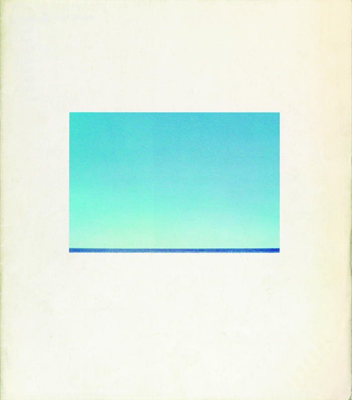
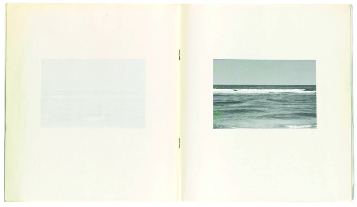
Jan Van Toorn, cover and spread for Jan Dibbets catalog, Van Abbemuseum, 1971 – [fig. 1, 2]


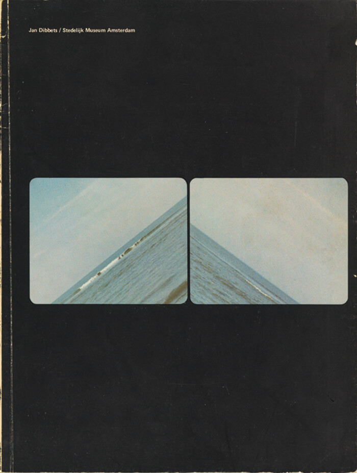
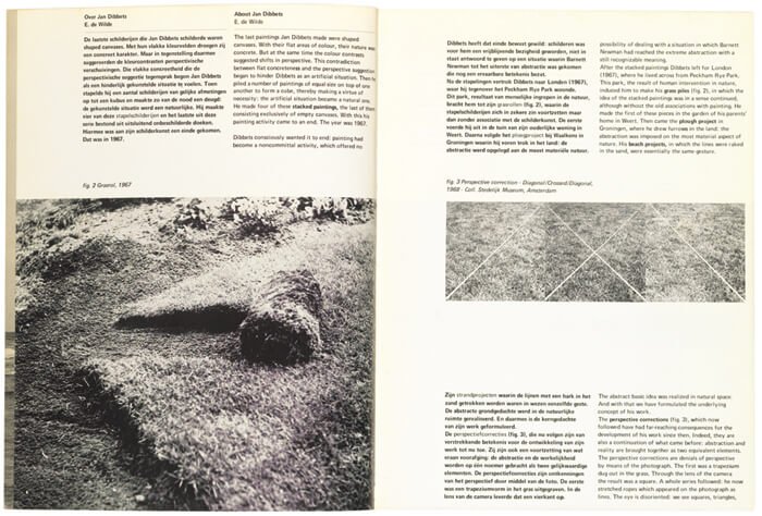
Wim Crouwel, cover and spreads for Jan Dibbets catalog, Stedelijk Museum, 1972 – [fig. 3, 4]
The Monacelli Press published in April 2015 the first English translation of a famous 1972 debate between Dutch graphic designers Wim Crouwel and Jan van Toorn, a public clash of subjectivity versus objectivity at Amsterdam’s Museum Fodor that helped set the stage for bold philosophical showdowns to come in design culture.
Held in response to an exhibition of Van Toorn’s work at Stedelijk Museum, including student posters protesting the Vietnam War—in an era of youth culture and increasing resistance to authority, capitalism, and the power of media—the stakes were aesthetic, ethical, and politically charged.
The following are excerpts from The Debate (ISBN: 9781580934121).
Over forty years ago, on a night in 1972 that was to take on mythic proportions, Dutch graphic designers Wim Crouwel and Jan van Toorn engaged in a public debate about their views and tenets. Titus Yocarini, then director of the professional organization of Dutch graphic designers (Grafisch Vormgevers Nederland, GVN), made an audio recording of that debate and the discussion that followed. Several years ago, this recording was recovered by curator and graphic designer Dingenus van de Vrie, and this constituted the occasion for a publication in Dutch in 2008, now translated into English.
It is exciting to be able to witness the verbal battle between two grand masters of design when they were young, but the other reason for publishing it is that the arguments of both gentlemen have perfectly withstood the test of time. Wim Crouwel and Jan van Toorn can be seen as representatives of two opposed schools of graphic design: the rational approach versus the personal approach. They represent the classical antagonism between the engineer and the artist, the graphic designer as a service provider versus the designer who is more intent on personal expression. During those years, from the mid-1960s through the 1970s, social and political commitment were hot topics as well.
Crouwel and Van Toorn have, however, continued to regularly voice and otherwise express their respective positions with great consistency ever since. The debate on November 9, 1972, was perhaps the most exhilarating manifestation of their ongoing discussion.
The occasion for organizing a public discussion between Wim Crouwel and Jan van Toorn was an exhibition of the latter’s work, as part of a series about Amsterdam–based artists. It was held in Museum Fodor, which at the time served as an “annex” of the Stedelijk Museum located on the Keizersgracht in Amsterdam. Previously, the Fodor had shown posters from the Paris student revolt of May 1968, in an exhibition designed by Van Toorn, which a critic writing for progressive weekly De Groene Amster dammer had characterized as “messy.”
In the fall of 1972, Museum Fodor put on display posters, calendars, and catalogs by Van Toorn in a rather informal exhibition designed by George Sluizer. The show also exhibited anti-Vietnam war posters made by Van Toorn’s students. As a Stedelijk Museum publication, the catalog for this exhibition was designed by Wim Crouwel and his assistant Daphne Duyvelshoff. For the Fodor they developed a standard typography: a red cover with a pink dotted grid, showing the title “fodor” together with the issue number, 8, in a computer-like typeface. The remaining text on the cover—data on Van Toorn’s career and on the exhibition’s dates and location—was printed in a black typewriter font. Instead of pages, however, the catalog contained a loose, poster-sized foldout comprising photo compositions and a handwritten credo by Van Toorn (set in all lowercase letters): an object of graphic design should not be looked at on the wall of a museum because the object’s design thus takes on too much importance of its own. seen in relation to content, after all, design is already dominant as a formal exercise. bear in mind that printed matter is made to function in a specific situation, and there primarily its meaning is determined.
While preparing the “catalog” for the exhibition, it was decided that both designers would continue their conversations in a public debate.
Grid v Intuition
Jan van Toorn
Grids are highly effective for conveying a message, but that is merely a starting point. You should not promote their use as the only way of design, or the only solution for arriving at great communication for the future.
Wim Crouwel
You say that I promote grids as the one true thing. I say that graphic design consists of a process of ordering for the benefit of the clarity and transparency of information. This needs to be founded on particular principles, because clarity and transparency on their own do not lead to quality information. There has to be an underlying principle as well.
My basic principles may have been characterized at times as subjective, but to me they are objective. When I depart from modular structures, then this is an underlying principle to me. These structures can be simple, but they can also be extremely complex. And I believe that design—not just graphic design, but also spatial design, architecture, and industrial design— benefits from a cellular approach, from a highly struc.tural approach.
Typography, for instance, is a preeminent example of such a process of ordering. Every form or shape in typography that wants to be more is one form too many. As a typographer you merely arrange information clearly so as to convey it in an easily readable way. That a clear arrangement may lead to incredible monotony is not at issue here; what matters is that you order things according to a specific point of view, from a basic principle. This is what determines form, and such form might well lead to a style as well.
In my view, typography does not have to be determined by tradition and history at all. It is time, I believe, that we throw overboard all those dos and don’ts that have kept typography in a straightjacket for so long. When as an alternative I advocate my structural approach, my cellular approach, which culminates in the use of grids for typography or spatial grids for architecture, I really have a different idea in mind.
Jan van Toorn
By traditional form I mean what you refer to as something determined by tradition. It does not so much pertain to style, but to our way of reading, the way of reading we have grown accustomed to. It does not just emerge out of the blue, but has a history. It is a case of historically determined human behavior. And you cannot simply act as if it doesn’t exist.
Working with grids, it seems to me, is a tremendous refinement of our tools, but it is not essential and only of interest to fellow professionals. We saw where systematic ordering ad absurdum leads us in the protests against the closing of the Hochschule in Ulm:* banners with perfectly clean typography. But in this way of protesting you do not see any identification with those you address, and this is a crucial problem for which a designer has to find a solution.
Wim Crouwel
Jan, I don’t believe in that at all. The lively concern of these people and their involvement—their angehauchtheit, as they call it in Germany—is equal to that of people who protest in more amateurish ways. Look at Paris ’68! The posters they made there are all obvious cases of amateurism; not a single one of them has any value. Not one of them is a good piece of design that really tries to convey an idea. It is all clumsy work that comes across as sweet, pleasant, full of feeling, but not as tough. Good designers could have conveyed the content much more strongly and this could have brought the movement more success.
Jan van Toorn
Why then did those designers fail to contribute? Because they are incapable of giving adequate answers. So all that remains is amateurism. The people in our profession have no answers.
Wim Crouwel
Jan, before the break let’s briefly return to the typography in the catalogs we make for museums. I have always taken the view that these catalogs should have a kind of magazine format, because they need to tell the museum’s story, rather than that of the artist. For this reason, they should be recognizable in their design as coming from an institution that takes a specific stance vis-à-vis contemporary art.
This has led to catalogs of which people said: “We can’t recognize the artist in it.” But the artist was present in the reproductions, and I have nothing to add to his story. The artist’s own story, when conveyed clearly and in a readable fashion by means of well-placed illustrations according to a certain principle, should be so powerful that he is always stronger than me. What I add to it is at most the specific objective of the museum involved.
In your catalogs for the Van Abbemuseum I recognize first and foremost the voice of Jan van Toorn, while that of the artist becomes perceptible only if I put in some more effort. As “pieces of art” these are great contributions to what is currently possible in free typography, but they are outright unreadable. I simply get stuck.
*By 1967 the Ulm School of Design was financially troubled and beset by faculty conflicts; some faculty members departed and the curriculum was scaled back. In 1968 the regional parliament in Bonn withdrew all funding to the school, forcing the institution’s closure amid student and faculty protests.
The Catalogues
Within a year of each other, Jan van Toorn and Wim Crouwel each designed a catalog for an exhibition of the work of visual artist Jan Dibbets (b. 1941). Van Toorn did so in late 1971 as the in-house typographer of the Van Abbemuseum, Eindhoven, while Crouwel did so in the same role for the Stedelijk Museum, Amsterdam. The character of each catalog differs significantly: the Van Abbesmuseum catalog (fig. 1, fig. 2) looks much like an artist’s book, while the Stedelijk one has a retrospective character. Similarly, the typographic views expressed are quite divergent.
On the back cover of the Van Abbemuseum catalog there are two brief comments on the work of the artist. Museum director Jean Leering starts off as follows: “In this catalog, Jan Dibbets would prefer not to see an introduction to his work. The work should have to be plain, as such, or rather, the meaning of the work only reveals itself by looking at it—through visual observation instead of verbal consideration.”
The front cover shows a field of two shades of blue, the surrounding white serving as passe-partout. Inside the booklet, it is revealed that the two shades refer to a blue sky over a dark blue sea. The images are printed in black-and-white, but in the same size and position as on the cover. They show, however, the horizon fading from view while the sea is on the rise. A loose insert lists the works on display.
Jan van Toorn worked as graphic designer for the Van Abbemuseum from 1965 to 1973. Each catalog he designed for Eindhoven has a markedly individual character and realization. Each time the specific topic of the publication had a strong influence on his typographic approach. For this reason, the designs all leave a different impression, making them distinctly recognizable.
Aside from two essays about Dibbets and his work, the unpaginated Stedelijk publication comprises a biography, a listing of selected solo and group exhibitions, a concise bibliography, and an overview of film and video works. The elaborate list of works on display is added separately.
Crouwel considered the Stedelijk Museum catalogs (fig. 3, fig. 4) as items in a series, requiring that each one be instantly recognizable as coming from that museum. He strengthened this identity through the rigid typographic views he systematically applied. For example, he always used the same typeface, Univers, always in the same size. Although Crouwel relied on bold or italics for typographic emphasis while avoiding variations in type size and underlining, he did experiment with color and different kinds of paper. His catalogs always had the same height, but their width could vary.
Crouwel designed catalogs for the Amsterdam museum for twenty years, from 1964 to 1984. His rigorous system to a certain degree neutralized the personality of the individual artist, the catalog’s actual subject. His preference for grids stands out. This layout plan for both typography and the placement of illustrations defined every design’s basic principles. He handled the opportunities provided by the grid in a highly disciplined way, creating a recognizable yet always unpredictable result. At the same time, each publication looked like an issue of a journal.
Within Total Design, the studio Crouwel set up with others in 1963, he further developed the notion of grids with such like-minded practitioners as Benno Wissing and Hartmut Kowalke. In the end, the development of grids and the standardization of typefaces, typesetting, and paper sizes not only saved time when working on assignments, it also ensured their quality. With the ready availability of grids on preprinted sheets, assignments could be executed quickly. And because all sorts of typographical problems were thought out in advance, not much time was lost in making design decisions.
As a result, it was possible to work on many assignments simultaneously, while the elaborated designs still had a uniform appearance. It was colleague Jurriaan Schrofer who once labeled Wim Crouwel as the “system-general.”
The Stamps
Wim Crouwel and Jan van Toorn both designed postal stamps as well. In the 1970s Van Toorn did a few assignments for the national postal service, PTT. In 1971 he designed a stamp for the Prince Bernhard Foundation, while in 1975 he created three stamps on topics related to Amsterdam (together with Paul Mijksenaar): two commemorating the capital’s seventh centennial and one on the Portuguese-Israeli community that had been in the Netherlands for three centuries. The original idea had been to design a sheet of one hundred stamps featuring images of Amsterdam residents from the last seven hundred years, with the overall color of the sheet changing from red to yellow.
Unfortunately, this idea was not feasible for technical reasons. The stamps Van Toorn ultimately designed are structured as a collage, showing a map, a procession of Amsterdam residents, and an image of the Portuguese Synagogue. Although the design of these stamps was a collaborative effort, they still look like typical Jan van Toorn designs.
The next year, Crouwel designed two series of stamps: one on the occasion of the Amphilex stamp exhibition, and the other to replace the famous number stamps by Jan van Krimpen from 1946. Crouwel used a modified version of his own typeface, Gridnik, which he had originally designed for Olivetti for use in typewriters but was never implemented as such. The name refers to a nickname given to Crouwel, Mr. Gridnik. The series of eleven variants printed in two opposite gradients remained in circulation until 2002.
The stamps concisely illustrate the preferences of both designers: while Van Toorn mainly pursues the use of images, Crouwel prefers emplying purely typographical means.
