
Functionalist with fascinations
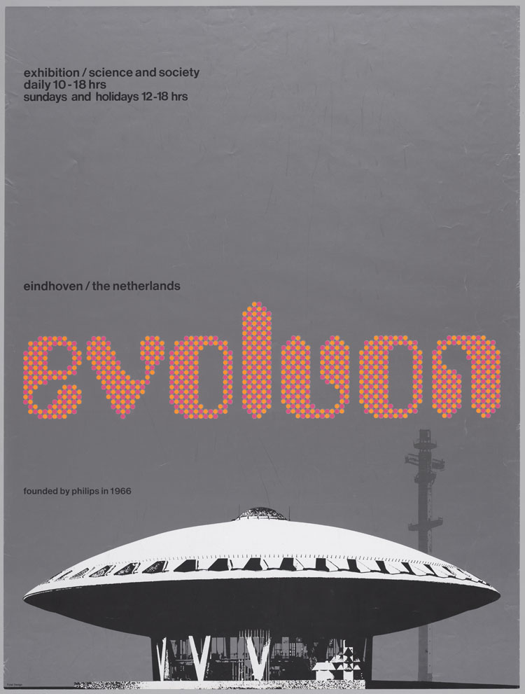
Wim Crouwel – Evoluon Poster 1966
Crouwel is an exceptionally industrious man. The number of ‘year-rings’ that he has accumulated give a completely false image. His oeuvre and the many functions he has fulfilled over the years do not fit within the usual standard of a ‘normal’ working life. Long days, long weeks, long years. Work as his life fulfilment. You only have to browse through the only monograph that gives an account of the first fifty years of his role in the world of design and you are confronted with an endless stream of productions . The book was published in 1997, 45 years after he had landed his first job with the exhibition stand builders Gebroeders Enderberg in Amsterdam. Meanwhile, even though more than ten years have passed, the irrepressible Wim Crouwel still has no intention of retiring.
He was my most important teacher and longstanding colleague. I was somewhat surprised about the title that Frederike Huygen and Hugues C. Boekraad have given to the monograph: Mode en module (fashion and module)[1]. Wim’s graphic and three-dimensional work is characterized by fixed underlying patterns that earned him the nickname ‘Gridnik’ a long time ago. This accounts for the module part. And he was most certainly interested in fashion. In the 1960s he showed experimental clothing by the designer Alice Edeling and had the reputation of being Holland’s best dressed man. His appearance and characteristic face did the rest. In many ways he resembled his close friend Paul Huf, who as a photographer also had close ties with the world of fashion.
But let’s be honest. The connection between the word ‘fashion’ and the modular character of his work was only made for the sake of alliteration and actually puts the reader on the wrong track. Because it is his work that is at stake, in which Crouwel actually distanced himself from fashions and trends. His work always had a ‘contemporary look,’ but also had a lasting durability – it withstood the test of time. As for clothing, he once made the totally unfashionable suggestion of dressing all the collaborators of Total Design in white lab coats. The idea was rejected. However, he did start wearing professorial bow ties from the moment he was nominated to the chair at the TU Delft. They suited him well and should actually be a required part of the dress code in those circles. The monograph, which was a long time coming, quickly sold out, but the long-awaited translation into an international language never materialized, nor did the indispensable reprint. This does Wim injustice. Compared with the voluminous books that are now being published about international greats as well as (not always historically significant) design groups, the realization of this book – although it was founded on such a solid basis – proved to fall short of the mark. A recent publication of the Japanese journal Idea gives a varied, excellent impression of his achievements in 2D-design, but contains little text[2]. It does, however, include a complete reprint of Pieter Brattinga’s ‘kwadraatblad’ from 1967, new alphabet, as well as Wim’s commentary in four languages, an example of his usual ‘Swiss’ thoroughness.
A Start in 3D and ‘Fusion Design’
Wim Crouwel’s world-wide reputation is mainly based on his graphic design – his posters, catalogues, books, calendars, postage stamps, etc. In Mode en module, the three-dimensional work is discussed at length, but elsewhere it has almost never received the attention it deserves. His first job with the Enderberg Brothers took Crouwel to showrooms, exhibition halls and trade fairs. Dick Elffers, one of the heavyweights of the still small postwar Dutch design community, had introduced the young (and totally inexperienced) Wim Crouwel to the stand builders. It was not long before Wim’s exceptional talent – who was trained as a visual artist at the school of arts and crafts in Groningen – manifested itself . And, although still a little ‘green’, he immediately displayed the charismatic presence that would lastingly pave his way through the world of clients and commissions. Soon Elffers gave Crouwel a free hand to work on large exhibitions of the post-war reconstruction period in which he was himself involved: De Rijn, Etappe 45–55, E55, Het Atoom. While working on these projects Wim met his Swiss colleagues Karl Gerstner, Gérard Ifert and Ernst Scheidegger. He fell under the spell of rationalised Swiss design, especially its typography. He acquired a special liking for the classic sans serif typeface Akzidenz Grotesk, which was almost unavailable in our country at the time. That letter was soon ‘canonized’. Quality never fails. It was not long before Crouwel was confident enough to set up shop as an independent designer.
The Koninklijke Academie in Den Bosch appoints him (he had, mind you, hardly any training in that field) as a professor of design. He starts to collaborate with the (only recently graduated) interior and industrial designer Kho Liang Ie. Wim becomes a teacher at the IVKNO in Amsterdam (later Gerrit Rietveld Academie). The Kho-Crouwel design studio carries on for four years (1956–1960). The traditions of Ie’s Indonesian-Chinese background are reflected in his humane, straightforward and atmospheric approach in his work, although this was something that Kho Liang Ie did not like to hear. In combination with Wim Crouwel’s rational, methodical nature, however, this led to a large number of very refined, stylish three-dimensional works. The functional meets the poetic. You could call it ‘fusion design’, with a reference to later hybrids of a culinary nature. Their joint work for among others Stichting Goed Wonen, De Bijenkorf, Auping and Linoleum Krommenie brought the young partners fame and good reviews. In 1958, Crouwel and Kho created a unique kitchen for graphic designer Otto Treumann. The influence of Ie’s teacher Johan Niegeman clearly played a role, as well as the admiration for international product designers such as Ettore Sottsass, Harry Bertoia, Charles & Ray Eames and Pierre Paulin – yet more examples of ‘fusion’.
I first became acquainted with Ie and Wim during my own study, when I was taking evening classes. I was deeply impressed by the elegant interior of Kho Liang Ie’s studio in the Warmoesstraat in Amsterdam and of the family houseboat of Wim and Emy Crouwel and sons, moored along the IJsbaanpad. Their collaboration ended on a friendly note when both partners came to the conclusion that besides the similarities in their approach there were also many differences. In Kho’s eyes, Crouwel’s ideas sometimes were too predetermined, while Wim sometimes found Ie overly poetic .
However, they remained close friends, a friendship that eventually came to a cruel end when Kho Liang Ie prematurely passed away, at the age of 47, on the first day of 1975.Turning Points Together with Tom de Heus, their colleague at the IVKNO, Wim and Ie were commissioned to design the interior of the Dutch pavilion at the 1958 Brussels World’s Fair. The building itself was not particularly eye-catching. For his work Wim was awarded his first royal (Belgian) order; it was later joined by others on his virtual lapel. Besides holding honours such as these, his ‘prize cabinet’ was replenished by other countries on a regular basis, in addition to the customary honorary memberships and academic honours.
In 1957 Wim Crouwel was chosen as a member of the (then only six years old) Alliance Graphique Internationale (AGI) – a clear proof of his growing reputation. The AGI brought together the acknowledged greatest talents from the world of graphic design. In the years 1979–1984 he acted as international president of the AGI. In 2006 he delivered an impressive and much applauded retrospective presentation of his career at the AGI Congress in Berlin. An absolute turning point in his career was his meeting with museum director Edy de Wilde.
Between 1957 and 1963 Wim was the resident designer of the Stedelijk Museum Van Abbe in Eindhoven, which was led by De Wilde. He designed countless posters and catalogues. This period in his oeuvre was characterized by attractive colour schemes and a frequent use of ‘occasional typography’ for exhibition titles. Starting from the artists’ work, Crouwel would draw their names in a one-off, specific typeface. These never developed into complete alphabets, but they were clearly steps in that direction. The letterform for ‘edgar fernhout’ required at least ten signs with all the characteristics of a family. Many – myself included – see this as a period of ‘Crouwelian’ milestones in poster art. The collaboration and friendship between the museum director and his designer enters an important second phase when Edy de Wilde follows in the footsteps of the legendary Willem Sandberg at the Stedelijk Museum Amsterdam. The switch from Eindhoven to Amsterdam almost coincides with the launch of the Total Design studio in early 1963. Together they created a unique series of catalogues, posters and exhibitions until De Wilde’s farewell exhibition, ‘La Grande Parade’, in 1984. In 1979 De Wilde gives Crouwel his own retrospective, which includes his complete works for the Stedelijk, a long series comprising many highlights. You could call it ‘Crouwel exhibits Crouwel’, a lavish visual feast.
Afterwards it emerged that Wim Crouwel systematically destroyed all his preparatory sketches. For the realisation of posters and catalogues on the basis of a grid that had remained unchanged all those years, Wim usually made instructional thumbnail sketches during the weekends, which were then faithfully blown up and translated by his assistants (Jolijn van de Wouw, Daphne Duijvelshoff, Magda Tsfaty and Arlette Brouwers) into complete layout instructions. Then the design was jointly evaluated and final details were ironed out. If necessary, he would even pass on the design for a poster to his collaborators through the phone. After all, there was already a clear-cut structure, the grid pattern units could simply be named.
In 1962, Wim Crouwel once again made plans to give up his private practice. His studio was housed in the attic of the printing firm Rijnja on the Reguliersgracht in Amsterdam. The time was ripe to join forces. That year, a number of discussions took place between people with a vision of the future in ‘design land’, inspired by the tumultuous developments in society, which had boomed after the post-war reconstruction period, opening new, broader perspectives. In the wake of successful examples in the US and England, designers such as Benno Premsela, Kho Liang Ie, Gerard Wernars, Peter Doebele, Charles Jongejans, Friso Kramer, Benno Wissing and Wim Crouwel thought about forming a multidisciplinary design group which, using each others specific qualities, would offer a broad range of solutions in order to meet the demand for coordinated design. Industrial, graphic (in its broadening sense), interior and exhibition design: all conceived on the basis of one shared vision. They had been stunned by the – not uncommon – fact that their London colleagues from FHK Henrion had succeeded in landing the commission for the entire presentation of our ‘own’ KLM in 1962 – right from under the noses of the dumfounded Dutch designers. A concept for a design studio was developed, which would be supported by the business acumen of outsiders Paul and Dick Schwarz. On 1 January 1963 the ‘TD Associatie voor Total Design BV’ was launched at Herengracht 567 in Amsterdam. In one of the coldest winters of the century everybody huddled around the red hot gas-heaters, while the surrounding building was being renovated after plans by Kho Liang Ie, who had decided not to join the design group. Crouwel, Kramer and Wissing were the leading design partners; for a while I was put in charge of the assistants, and when that didn’t work out I was asked to set up my own team and subsequently to join the creative board of directors.
Those were great years, but at times it seemed as if The Netherlands wasn’t ripe for such a venture. Initially, important commissions for coordinated design were hard to come by. We did succeed with Auping. The presentation of Nederland Transportland at the large Verkehrsausstellung in Munich was exciting. ‘Die Holländer’ was an enormous, spectacular crate, realized in collaboration with architects, photographers and filmmakers, and even included projected images above an ‘inland sea’.
Even so, the structure of the individual teams (a senior designer with a number of assistants) within our design group often proved to be stronger than that of the group as a whole. They operated as relatively closed units that did not really play together as an overall team – units with their own particular strengths. There was an exchange of specific qualities, but less then was intended.
One important campaign was the visual identity of the SHV (with PAM, GTI, Makro and a large number of other subsidiaries), under the leadership of Benno Wissing. The partial commissions from SHV had all the characteristics of ‘total design’. Makro and later De Gruyter were indeed projects with a very multifaceted programme.
Designing the signs for the new Schiphol Airport in 1967 was a team effort of Benno Wissing with our friend Kho Liang Ie. In essence it was a rather technical project, but with wide-ranging psychological implications. How do you put a hurried international crowd at ease? In the meantime, Wim himself regularly excelled with his innovative, bold designs for the calendars for the Amsterdam printing firm Erven Van de Geer.
The Expo Osaka 1970 project, the World’s Fair, was particularly challenging. Wim was part of a multidisciplinary team of architects, visual artists, photographers, filmmakers and fashion and interior designers. This was, of course, a very prestigious and, in 1969, a very lucrative event. Among others, Crouwel designed the logo of the Dutch pavilion, the exterior furnishings, certain aspects of the interior and the information units. An ingenious, exceptionally large map represented the projected development of The Netherlands in the years 1970–2000. Wim also designed the accompanying printed material and the Dutch postage stamp that was issued on the occasion of the Expo. At Total Design, Crouwel’s main assistants on the Osaka project were Jolijn van de Wouw and the Israeli Eli Gross. The Dutch pavilion attracted a large crowd of visitors. However, it did not escape the fate that generally awaits pavilions at world’s fairs. What remains in the end is mainly a collection of photographs and slides. Nevertheless, Wim’s contribution to the project is one of the absolute gems in his oeuvre.
TD’s ‘organized design’ suffered harsh criticism in the press from among others Piet Schreuders and Renate Rubinstein. Wim Crouwel’s number postage stamps (which nevertheless remained in circulation for a very long time) and a new, more accessible concept for the telephone directory were targeted as ‘expressions of the new ugliness’. Tamar in Vrij Nederland: ‘Oxenaar and Crouwel are ruling over our aesthetic order.’ Sense and nonsense, with ‘corporate style mania’ as the new swear-word. Never mind. It would all blow over in the end, but for a while TD was the favourite butt of everybody’s scorn. The rise of these oppositional forces was typical of the sometimes playful wave of protest and critical ideas that had spread through the free world since 1968 and that was the done thing at the time.
The criticism of the telephone directory’s design, on which Wim collaborated with Jolijn van de Wouw, was based on a number of misconceptions about the intentions and the role of the client. The typography, which was user friendly, went a couple of steps too far in the eyes of the critics. When things threatened to go sour the clients did not really play fair. As ever a gentleman, Wim kept them out of the spotlight. Conflicts are not one of his favourite pastimes and he did not want to spoil relations.
Corporate clients were drawn by Crouwel’s considerable reputation. I will restrict myself to a list of names. They are certainly no small fry: IBM, Rabobank, Friesland Bank, Bouwfonds Nederlandse Gemeenten, Boskalis-Westminster, Campina, PTT, Teleac, the cities of Groningen and Rotterdam, and Al Futtaim (UAE). With his flair, aura and authority he generally handled these heavyweights quickly and efficiently. Wim also worked on the physical (interiors and exteriors) presentation of the Amro Bank, in collaboration with bureau Premsela-Vonk.
Crouwel’s concept for the Grote Spectrum Encyclopedie E’73 was particularly innovative. The client wanted to distinguish himself in the areas of accessibility, legibility and visualization. With his team, Wim developed a lay-out grid that resulted in twenty volumes of approximately 540 pages with a very distinct visual atmosphere.
A lot of the commissions came from the cultural sector. Over the years Wim Crouwel had become a well-informed expert in the visual arts. He played an important role in the formation and design of the Peter Stuyvesant Collection of the Turmac Tobacco Company. His work for museums (the Fodor Museum in Amsterdam was part of the ‘Stedelijk Museum Group’) brought him into contact with the national and international masters of modern art. One day, namely in 1985, thanks to his knowledge of and enthusiasm about contemporary art, he would become director of Museum Boijmans Van Beuningen in Rotterdam. As a museum director he gave graphic commissions to the London-based designers group ‘8vo’. 8vo were rather orthodox, but in a way also heirs to the old TD philosophy. His period as a director was characterized by a number of large exhibitions. He designed ‘De verboden stad’ and ‘1928’, Wim’s year of birth and a year of numerous industrial innovations. He retired from Museum Boijmans Van Beuningen in 1993. Nevertheless, Wim Crouwel continues to make a mockery of the contemporary debate about retirement age.
Let’s return to the story. In 1968, after Friso Kramer had already established closer ties with the business world, a heated debate broke out among the directors of Total Design about the relation between corporate business and design. In the end, to the great frustration and lasting distress of Wim and other dedicated members of the TD-family, this led to the departure of Benno Wissing, some of his collaborators and the Schwarz brothers.
In the following years Wim Crouwel started spending more time at the TU Delft. Simultaneously, he began to gradually and at first discreetly cut back on his involvement in Total Design. It all began with a teaching assignment at the TU (1970–72), followed by an associate professorship (1972–78). From 1980 to 1982 he taught at the faculty of industrial design and meanwhile stayed on at Total Design in an advisory function. He was a professor at the TU from 1982 to 1985. The last two of those years he also acted as dean of the industrial design department. From 1987 to 1983 he was associate professor of art and cultural sciences at the Erasmus University in Rotterdam. His acceptance speech was titled ‘Functionalism and Style’. He gave an overview that focused mainly on pre-war movements and on figures such as Louis Sullivan (‘form follows function’), the Shakers, Peter Behrens, Ludwig Mies van der Rohe, Frank Lloyd Wright, Walter Gropius, Marcel Breuer and – from the post-war period – Herbert Bayer, Buckminster-Fuller, Charles and Ray Eames, Saarinen and George Nelson. This was Crouwel’s creed, which he has extended to our present day. He argued that functionalism was the last great style, after classicism. I find the following quotation particularly significant:
‘I hope to have made clear that between functionality and functionalism there is the essential element of emotion, which allows us to avoid dull mediocrity.’
This impressive lecture still deserves more than just a cursory mention in bold type size 5 (or was it 4?) in Mode en module.
Mode en module also includes an extensive biography mentioning all the relevant facts about Crouwel’s career up to its publication in 1997. The number of important functions, appointments, participations in panels, lectures, publications, awards, chairmanships and advisory functions runs in the hundreds. That list alone justifies the conclusion that Crouwel has led more than two lives in the time that has been granted to him. After 1997 this pattern simply continued. Never a dull moment.
Fascinations
Wim is an aficionado of technology and speed. When I first met him, he used to take me for a ride in his Morgan sports car and tear through town, my butt close to the pavement. In the attic of the neighbouring building Herengracht 569, which was always carefully locked, Wim Crouwel and his friend, the designer Rudi Wolf, built a racing car for the Holland Racing Team, which was completed in 1970. On the occasion of his retirement from Museum Boijmans Van Beuningen, a collection among friends and admirers was used to offer him an MG. He has no trouble stripping a car down to the last bolt and then reassembling and completely refurbishing it.
Architecture is his actual dream job, a calling which came too late. He must have been overjoyed when his son Mels became a well-known architect. His son Remco is a graphic designer and his daughter Gili followed in the footsteps of her mother, Judith Cahen, and became an art historian. It’s all in the family. If Wim were to reincarnate some day, it would probably be as the successor of Mels.
Rediscovered
It appears as if there has been a late turn-about in the 1970s debate about ‘the new ugliness’. In recent years there has been a growing awareness and appreciation of Wim Crouwel ‘then and now’. All over the world people are rediscovering and reconsidering the pioneering work of Crouwel and the old Total Design. The exhibition ‘Wim Crouwel: architectures typographiques 1956–1976’ at the Galerie Anatome in Paris, that specializes in design, was visited by a truly international bunch of old followers as well as by an exceptionally large younger crowd. His new alphabet has now become widely popular – at last, I could say. David Quay’s London firm ‘The Foundry’ has digitalized some of Wim Crouwel’s fonts, designed ages ago. The rigid grid on which these letters are based made it easier to prepare them for renewed use. Young contemporary designers are eager to work with them.
Wim Crouwel, who as an artist made his first tentative entry into the world of graphic design when he was barely 20, would continue down that road with great dedication and love for another sixty years. Congratulations, Wim!
Ben Bos BNO/AGI
Notes
1 Frederike Huygen and Hugues C. Boekraad: Wim Crouwel – Mode en module, ed. By Hester Wolters, iconography and design by Karel Martens and Jaap van Triest, Rotterdam: Uitgeverij 010, 1997.
2 ‘Wim Crouwel’s Avenues Into the Experimental Worlds,’ in Idea 323, 2007/7.
3 An almost inaccessible attic in the back part of the house at Herengracht 567, above the reception-canteen of TD, served as the ‘secret’ depot of the works of the young painter-artist W. Crouwel. Maybe they are still there, undiscovered, forgotten during the move to the Van Diemenstraat,?
4 This characterization is taken from Ineke van Ginneke: Kho Liang Ie, interieurarchitect/industrieel vormgever, Rotterdam: Uitgeverij 010, 1986