
Christopher Wool Interview with Ann Temkin
Christopher Wool. Untitled. 1990
Ann Temkin: How did you come to use the phrase "FLOAT LIKE BUTTERFLY, STING LIKE BEE"
Christopher Wool: "Float like a butterfly, sting like a bee" is of course Muhammad Ali’s phrase. Initially I had been drawn to text because I wanted to make a work that was a little more direct, a little louder, that talked a little more directly to the audience, than some of my abstract paintings had, and working with found text often seemed suitable. But I wrote a few of the phrases in my paintings.
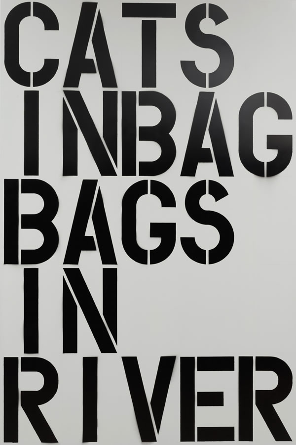
The found texts I used were mostly less known than this one. The phrase "SELL THE HOUSE, SELL THE CAR, SELL THE KIDS" is from the movie Apocalypse Now I even titled the painting Apocalypse Now [1988] I did a painting with the phrase “CATS IN BAG, BAGS IN RIVER"; that wasn't well-known at all, but it's a line from the movie Sweet Smell of Success [1957]. Sidney Falco, the Tony Curtis character, does a dirty job for J. J. Hunsecker, the Burt Lancaster character, and to tell him he's done the job—they're in the 21 Club so they have to talk in code—he says, "The cat's in the bag, the bag's in the river." Clifford Odets wrote the screenplay, and Harper's Bazaar did an article recently about that for which they interviewed Tony Curtis, who said, "When I heard that sentence, it went straight to my brain." It was an important line.
AT: But you picked it out without knowing that.
CW I loved the poetry—It was a poem. Richard Prince once said that the great contemporary haiku was the advertising line "Raid kills bugs dead"—this perfect line. And "Float like a butterfly, sting like a bee" was also a great multivalent line. You could read it in so many ways.
AT: You've said it had been floating around in your heat for a long time before you made the painting—it wasn't something you selected on this particular occasion.
CW: No, I'd even used it for the title of another painting. It was in my mind because I'd seen William Klein's documentary on Ali [Muhammad Ali, the Greatest,1974]. The line was actually written not by Ali but by Bundini Brown, his trainer. They were friends from the beginning of Ali's career. So in the film, Ali's preparing to fight Sonny Liston and he and Brown just chant this back and forth.
AT: And the phrase stuck with you.
CW: I certainly knew it before I saw the film, but maybe that was the moment when I thought of it in terms of a painting. I actually knew the phrase before I knew its lineage; I'd looked it up in Bartlett's and discovered that it was attributed to Bundini Brown. But Ali made it famous, it certainly wouldn't exist without him. That was the great thing about Ali, he could be seen as a poet as well as a boxer. I think Brown made up the line about him as a description of the way he fought: he was fast and he had sting. I like the idea that the image might do what the text said—that a painting could "float like a butterfly, sting like a bee." Both say it and do it.
AT: How did you arrive at the composition?
CW: I'd been making abstract paintings and word paintings at the same time. When I say I'd been making abstract paintings but had a desire to speak more loudly and directly, I don't mean that I wanted to cancel what I'd been doing with the abstract paintings; it wasn't that they were unfulfilling, there was just a frustration with being unable to speak in another way. So I continued to work on the abstract paintings when I was doing the word paintings. Oddly the abstractions from that time and the "FLOAT LIKE BUTTERFLY" painting are much more similar to each other than either of them is to the abstract work I'm doing today.
Back then, for whatever reason, I felt a need to limit the composition and the color. The abstract paintings had an allover composition, and the word paintings did too; but the fact that the word paintings used text meant they had a certain structure already, the sequence of letters was a given. If I were to change the letter sequence for compositional reasons, I'd give myself other problems: I'd end up with different words! So the fact that there was a sequence of letters that started in the upper left and ran left to right allowed me to drop composition. Not completely, but as far I could—as far as I ever have. The width and height of the letters were the only way to change the composition. I'd work those things out in advance, trying many different forms. There's a drawing for this painting that has a different composition and different dimensions. Sometimes I'd feel that changes in composition really affected the quality of the painting; other times they didn't make as big a difference. So I couldn't absolutely remove composition, but I went as far as I could in that direction.
Those issues aren't so important to me today. I still have a certain desire to defy composition, but I do it in a different way now; it's not so much about composition per se as about pushing composition away from traditionally modernist practices, from notions of the proper composition, the good composition. I recently read a Clement Greenberg essay in which he goes on about the corners of a painting, and how a particular painting fell apart in the corners. That was really interesting to me; for me, paintings often have trouble in the corners, it's something I've noticed in my studio. But for Greenberg to say that paintings live and die by what's done in the corners, though—that was a bit shocking.
AT: In the paintings you made with rollers or stamps in the mid-to-late '80s, were you looking for a way to minimize the role of the artist's creativity?
CW: Yes. In the same way that I was drawn to text that had already been used in a different context, I found it satisfying to use already given patterns and images. They were tools; the paintings weren't really about them. People seem to have misunderstood what I was doing in those paintings; they thought I was deconstructing painting, making a statement about artmaking. Whereas I felt that I was just making paintings, albeit self-conscious ones. As far as I was concerned all those issues had already been dealt with by other artists.
AT: Yes, but theorizing about art was so prevalent then that it would have been tough to avoid it.
CW: I just wasn't that interested. And the artists I knew weren't so interested either. Yet when I was working in the studio—and some of this I only realized in retrospect—I found myself facing same of the same issues that were being discussed in critical theory. I may have felt a strong desire to take composition out of painting, for example, and to eliminate a modernist kind of decision-making—but not because I was interested in some way in deconstructing artmaking. It wasn't for a conceptual reason. For me Richard Prince was great because he absolutely summed up all these issues in critical theory but there was nothing theoretical about his work.
AT: I'm suspicious when new art seems to be fulfilling a preconceived idea of what should be or do.
CW: I think a lot of young artists think that way. I didn't really go to art school, so I didn't have to unlearn a lot of stuff—I just didn't have it in the first place.
AT: But I've read you studied with Jack Tworkov?
CW: I went to college for a year, when I was just out of high school, and studied with Richard Poussette-Dart. Then I went to art school for a year and studied with Tworkov. But after that there was no school except some film school.
AT: Were there other important influences?
CW: I was always drawn to the post-Minimalists more than to the Minimalists or the Conceptualists. And I was drawn to Andy Warhol more than to whoever his contemporaries in Conceptual art would have been.
AT: Who are you calling post-Minimalist—Richard Serra? Bruce Nauman?
CW: Yes, or even someone like Vito Acconci, whom I don't think of as Conceptual per se.
AT: He dealt more with process.
CW: And for me, as a painter, process was crucial.
AT: That's clear. Yet the interesting thing to me is that process is also identified with a quintessential high-modernist idea of painting. The obvious example is Jackson Pollock, and the romanticized part of gestural action painting that many people associate with him. So your interest in process was taking you into the eye of the storm in a way.
CW: But think about Warhol. With his use of silkscreen and other such, his work was concerned with process also, and was certainly not the ideal of high modernism. And I don't think anyone would say Acconci or Nauman represented an ideal of high modernism. Process has always been important to me. When I made the word paintings, even though I almost always worked out the composition in advance, the process was still important. Even showing that process was important; they had to look hand-painted. I first picked up on this in Brice Marden's monochrome paintings.
I think even Warhol allowed the visual residue of the process of making the painting to be an entrance into the picture, something that pulled your eye in. That was harder to see at the time; it's much easier to see now. It's certainly true about Warhol's use of silkscreen. His rap about wanting to be a machine was undermined a little by that.
AT: At first everyone believed it.
CW: If he was a machine, he didn't care about being a very efficient one.
AT: The story of discovering how much process matters, even, say, in a readymade by Marcel Duchamp, is to some degree the story of the increasing understanding of a work of art. Cases where there first seemed to be no care involved, as in a Warhol silkscreen, are now seen to be laden with care.
CW: Yes, exactly, I guess you could equate visualizing the process of making the work with visualizing the actual inspiration for the work itself. Through the late '70s, the garage-hand aesthetic pertained in the idea that it really wasn't important how you did something, it was just important what you did. The how-to was irrelevant. Robert Gober had a great influence on me: seeing that his sinks of the mid-'80s were hand-made—and seeing the relationship of the handmade them to, say, Duchamp's ready-mades—was fascinating to me. Even in my earlier works, the handmade was an issue.
AT: But you did think of yourself as a painter all along, except for that quick break into film in the late ‘70s? Smelly studio, the whole thing?
CW: Yes. I don't think you could make paintings at that time without being aware of the implications of making a painting—I certainly was—but that's different from just deconstructing a painting.
AT: Did your decision to work on aluminum have anything to do with a desire to resist any conventional stereotype of a painter? Or, putting it another way: what role did the aluminum play?
CW: With the text paintings, for reasons both technical and visual, I really wanted and needed a flat, hard surface. It helped them look like signs. The reason aluminum is used in signs is that it helps make them more visual—stronger. But I became a little uncomfortable with aluminum, and with the fact that it wasn't seen the way a traditional medium might be. It worked visually for me, and it worked technically as a material, but I was never that comfortable with its implications. Now I'm working on linen and finding it very workable. I'm much more comfortable with it as a material that painting is commonly identified with. It's funny: the quadruple-primed linen that I use now is primed by machine, so in some ways it's got an even more industrial look than the aluminum did—but an industrially primed canvas doesn't look like a product of industry.
AT: Right, we're conditioned to think of canvas as an art material. In the text paintings, what kind of black paint did you use?
CW: The black is always the same but there are different white grounds. I was still putting those on myself at that point, spraying acrylic paint. Later I found someone at an auto body shop to do the grounds, and he sprayed Mercedes Benz primer. (Later I found someone who put on a lot of the grounds.) I used Flashe, which is pretty industrial looking, like auto-body paint, although it does look hand-done if you look carefully enough. The black is a sign-painter's paint. It's a super-high-quality paint, with a lot of pigment. I use the same paint still.
AT: How did you choose your stencils? On the one hand stencils seem generic, but there are many varieties of stencils.
CW: Absolutely That's an important issue. Again, I didn't think it out in a critical way; stencilling was just the simplest, most direct way of making these paintings. But to make those by letters I had to draw and cut stencils myself. They had to be cut to size, to fit the painting. You can only get stencils in a smaller size than I wanted, so the alternative would have been fitting the painting to the stencils. So I cobbled this stencil type together I modelled it after store-bought stencils, but I had to make a lot of changes. Certain letters didn't look the way I wanted them to. So I used a standard commercial stencil as a model and cut my own.
AT: I notice that the "B" is irregular.
CW: The "B" is odd. I wanted to keep everything symmetrical, and the standard "B" stencil didn't work because the top and bottom weren't the same. It just didn't look right. In a sense I restandardized the stencils, because they weren't so standard-the letters were connected in irregular ways.
AT: Did the store give you many typefaces to choose from?
CW: I wasn't interested in typefaces, I didn't know type from anything. And I wasn't interested in design. The few times I've tried doing billboards they weren't so successful—for me it was a contradiction trying to make art within an industrial-design or even a design context. It was the same thing with flowers: when | was using flowers, it was assumed that | was interested in them, or that | was interested in pattern and design. But actually | was interested in the displacement of pattern, in putting pattern into painting. | wasn’t the first to do it. | wasn’t the first to put text into art, either, taking it from the real world and putting it into painting, that displacement was part of the work. So making “word painting” into billboards and putting
them back into the real world didn’t work.
AT: The effect was neutralized. Would you keep the stencils you made as an inventory for new paintings, or were they for one-time use?
CW: I'd occasionally use them again, if | needed the same-size letter. | took care of them. But | don’t think there were many paintings for which | reused stencils.
AT: What were the steps in painting the lettering and the ground? Did you finish the ground and then draw on it with the stencils?
CW: Getting the white on was more of’ a priming issue than a painting issue. And | didn't draw with the stencils, | actually painted through the stencils. That’s what gives you that bleed.
AT: Would you lay out the stencils for the whole painting and then paint?
CW: No, I'd do one letter at a time. That way | didn’t have to cut as many stencils—! only needed one “T,” for example. There was also a technical concern: | couldn't do all of them at once, because the paper border of the stencil for, say, the “U” in the second line would cover the bottom of the “T” in the top line.
AT: You hand-painted the letters with a brush.
CW: Yes. And | did a pencil grid to use as a guide. You can see it in the paintings, although | did it quite tightly.
AT: In a Village Voice review [May 31, 1987] Gary Indiana talked about the “glitches” in your paint surface, which I thought was a great word for them. But this painting seems quite clean.
CW: Some of the paintings are more painterly than others, for expressive reasons. | played with that to a certain extent. If | remember right, this was a particularly inexpressionistic painting.
AT: The degree to which you wanted a work to look “painterly” varied?
CW: Yes. Sometimes for a specific reason, other times for no particular reason. It’s interesting with the pattern paintings: some of the more expressive ones are relatively more dry and severe. And when I pushed the elements of process and chance, there was always a point where the painting started to be less interesting and less expressive.
AT: The whole idea of painterliness equating to expression is really a fallacy.
CW: Yes. At that point | was still just trying to figure out how much expression you could pack into something, or else how little—how much expression you could take out.
AT: Well, along that line, you also removed from this quote two uses of the word “a”—” Float like a butterfly, sting like a bee.”
CW: They didn’t fit. Boy, those are difficult issues. | did it also with "CATS IN BAG”: the text was “The cat's in the bag, the bag’s in the river’ but | dropped the “the’s.” The issue was always a combination of image and structure. Was the image more direct, more interesting, pared down to its essentials? And how did that affect the composition?
When | was working on the text paintings, it was difficult for me to know how they‘d read to someone else. Some of them | broke down so they were harder to read, and I'd often have to invite people into the studio and get them to read them to me. Then | could find out whether they were legible or not.
AT: How would you work out the divisions between the words? With paper and pencil?
CW: Yes, I’d grid them up on sheets of paper, over and over. I'd even cut and paste the paper. Some paintings were more difficult; sometimes that process went on for quite a while before | worked it out. Often I'd have texts that | was playing with, but | couldn't figure out a way of making paintings from them. “CATS IN BAG, BAGS IN RIVER” went through all kinds of permutations. With a few paintings | did a couple of versions in different permutations.
AT: You say that the text paintings were simultaneous with the pattern paintings: did that mean that you'd be working on both types of painting in the studio at the same time?
CW: Absolutely, even on the same day. | thought it was interesting to show them together, too. It was important to me to show that they spoke in different ways about similar kinds of things. It was also useful to call attention to their differences.
AT: You’ve talked about your interest in the audience’s reception of your work. Did that have anything to do with your desire to make paintings louder or more direct than the abstract pattern paintings had been?
CW: As an artist, you never really know how and what people are seeing in a work. | didn’t have a sense that the audience saw the abstract work as quiet; | just had a feeling that | was speaking quietly somehow. The idea that | wanted to do something louder—that really came from me, not from some idea about the audience. | always try to be aware of audience response, | think it’s important, but | basically work in my studio for myself.
AT: The last word paintings you made were finished about ten years ago, if I’m not mistaken.
CW: The last real group was '95 or 96, and | made a couple more in ’97. | never decided to stop making word paintings, | just lost interest—I don’t at all rule out returning to them. At some point it would be quite natural to do them again.