
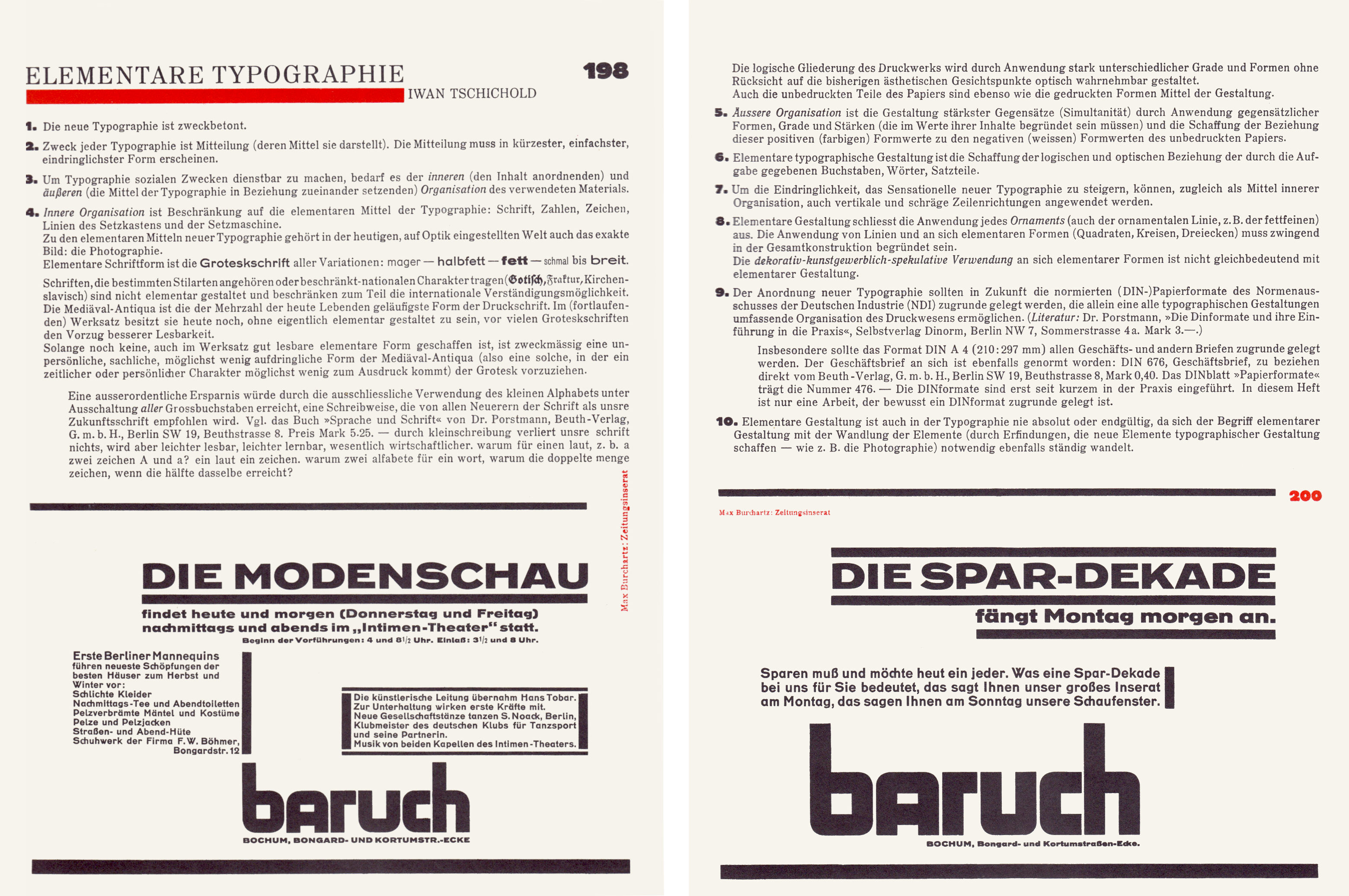
Internal spreads of Typographische Mitteilungen. Sonderheft: Elementare Typographie (Typographic Studies. Special issue: Elemental Typography), vol. 22, no. 10, 1925
Elemental typography: Jan Tschichold
1. The New Typography is oriented towards purpose.
2. The purpose of any piece of typography is communication (the means of which it displays). The communication must appear in the briefest, simplest, most urgent form.
3. In order to make typography serviceable to social ends, it requires the inner organization of its materials (the ordering of content) and their outer organization (the means of typography configured in relation to one another).
4. Inner organization is the limitation to the elemental means of typography: letters, numbers, signs, rules — from the typecase and the composing machine.
In the present, visually-attuned world, the exact image — photography — also belongs to the elemental means of typography. : The elemental letterform is the sanserif, in all variations: light, medium, bold, and from condensed to expanded.
Letterforms that belong to particular style-categories or which bear definite national characteristics (Textura, Fraktur, Church Slavonic) are not elementally designed, and to some extent limit the possibilities of being understood internationally. Mediaval-Antiqua [old style roman] is the most usual form of typeface for the majority of people. For the setting of continuous text, it still — without being elementally designed — has the advantage of better legibility over many sanserifs.
As long as there exists no thoroughly elemental form that is also legible in text setting, it is appropriate to prefer (against a sanserif) the least obtrusive form of Mediaval-Antiqua — one in which period or personal characteristics are least evident.
An extraordinary economy could be achieved through the exclusive use of small letters — the elimination of all capital letters; a form of writing and setting that is recommended as a new script by all innovators in the field. See the book Sprache und Schrift by Dr Porstmann (Beuth-Verlag, Berlin swig, Beuthstrafe 8. Price: 5.25 marks). Our script loses nothing through writing in small letters only — but becomes, rather, more legible, easier to learn, essentially more economical, for one sound, for example ‘a’, why two signs: A and a? one sound, one sign, why two alfabets for one word, why double the quantity of signs, when a half achieves the same?
Through the use of strongly differentiated sizes and forms, and without consideration for previous aesthetic attitudes, the logical arrangement of printed text is made visually perceptible.
The unprinted areas of the paper are as much a means of design as are the visually appearing forms.
5. Outer organization is the forming of the strongest contrast (simultaneity) through the use of differentiated shapes, sizes, weights (which must correspond to the value of their content) and the creation of the relation between the positive (coloured) formal values and the (white) negative values of the unprinted paper.
6. Elemental typographic design is the creation of the logical and visual relation between the letters, words, and text, which are given by the job in hand.
7. In order to increase the sense of urgency of new typography, vertical and diagonal lines can also be employed as a means of inner organization.
8. Elemental designing excludes the use of any ornament (also ‘swelled’ and other ornamental rules). The use of rules and inherently elemental forms (squares, circles, triangles) must be convincingly grounded in the total construction.
The decorative-artistic-fanciful use of essentially elemental forms is not in keeping with elemental designing.
9. Ordering of elements in new typography should in future be based on the standardized (DIN) paper formats of the Normenausschuss der Deutschen Industrie (ND1), which alone make possible a comprehensive organization for all typographic design. (See: Dr Porstmann, Die Dinformate und ihre Einfihrung in die Praxis, Selbstverlag Dinorm, Berlin NW7, Sommerstrafe 4a. 3.00 marks.)
In particular the DIN format A4 (210:297 mm) should be the basis of all business and other letterheadings. The business letterheading has itself also been standardized: DIN676, ‘Geschaftsbrief’, obtainable direct from Beuth-Verlag, Berlin SW9, Beuthstrae 8; 0.40 mark. The DIN standard ‘Papierformate’ is number 476. The DIN formats have only recently been introduced into practice. In this special issue there is only one job that is consciously based on a DIN format.
10. Elemental designing is, in typography as in other fields, not absolute or conclusive. Elements change through discoveries that create new means of typographic designing — photography, for example — therefore the concept of elemental designing will necessarily also change continually.
Translated by Robin Kinross from Elementare Typographie (Sonderheft), Typographische Mitteilungen, vol. 22, no. 10, October 1925, pp. 198–200.