
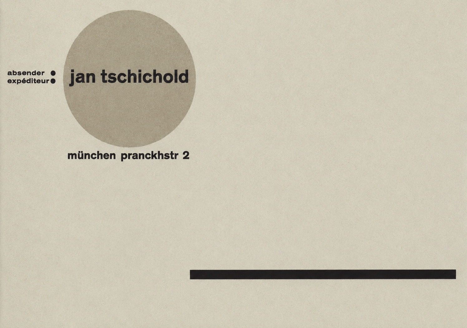
Jan Tschichold. Promotional postcard, 1928, (10.5 x 14.8 cm)
Marginalia on remarks by Jan Tschichold: Hans Peter Willberg
Tschichold had enemies. Not just people with differing views on what should be taught (‘for indenting’ - ‘against indenting’), but typographers who felt that they had been hurt by Tschichold, and reacted aggressively. How did this animosity come about? I suppose the fact is, that Tschichold defended what he thought was correct, without apology or hesitation (that is, hesitation in disturbing the susceptibilities of others). This was true of both the early and the later Tschichold. How cautiously his typographic colleagues expressed themselves! ‘He is, perhaps, a little too elegant’, ‘a certain danger of over-styling’, ‘not quite so good as he used to be’ - these comments are the most specific and severe to which other typographers will commit themselves. Not so Tschichold. ‘Whoever does not indent paragraphs is a bad typographer. Whoever designs a squint column of type is a bad typographer. Whoever deliberately tries to design modern typography is a bad typographer. The word ‘Gestaltung’ comes from National Socialism, and must not be used.’ Right. Wrong. - Such dogmatic opinions arouse indignation; such indignation is lacking today.
An article on typography which contradicted Tschichold’s precepts was sent to him with a request for comment and in the hopes of controversy. ‘I’d really have my hands full’, replied Tschichold, ‘if I attempted to argue with everyone.’
A complicated work of scientific bibliography required ‘programming’. (The word ‘program’ was never, as far as I know, used by Tschichold, he gave instructions. But are not the full and accurate instructions for punctuation, paragraphing, and typography of a book the prototype of a design program?) Authors’ names and book titles, in various categories, various distinctions in emphasis, notes, references and quotations, all have to be dealt with correctly. The typographer may look for ad hoc solutions, but it is better to consult the experience of others. The text-books are all unhelpful; the first time the subject was dealt with satisfactorily was in Tschichold’s essay ‘Italic, small caps and quotation marks in the text of books and scientific journals’, in his book Ausgewählte Aufsätze über Fragen der Gestalt des Buches und der Typographie, 1975 (Selected Essays on Book Design and Typography). If only he had produced a Meisterbuch der Typographie, in which all the basic aspects of book design were covered, it would have provided the real answers for all typographic programming.
The young Tschichold’s revolutionary manifesto, which appeared under the title ‘elementare typographie’ in the Leipziger Typographische Mitteilungen (Leipzig Typographical News), consisted of ten points. Some were basic, e.g.: 1. The new typography is purposeful. 2.The purpose of all typography is communication. Communication must be made in the shortest, simplest, most definite way. 3. For typography to perform its social function, there must be organization of its component parts, both internal (i.e. content) and external (consistent use of printing methods and materials). 4. Internal organization is restriction to the basic elements of typography: letters, figures, signs, lines of type set by hand and by machine... the unprinted parts of the paper contribute as much to the design as the printed parts. ...
The other points follow on. For example: the logical articulation of a piece of printing is achieved by the use of clearly contrasting types and type sizes, without reference to the modes of the past. 7. In order to get the full force and power of which the new typography is capable, the designer may make use of vertical and oblique setting.
There is no basic point among these concepts with which the later Tschichold would not agree. But the typographical conclusions of the later Tschichold are of a different kind: they derive from new perceptions, based on later discoveries and experiences. The alleged contradictions are no more than that.
A quotation from my own contribution to Tschichold’s 70th birthday symposium may be permitted: Tschichold’s supposed change of opinions is still today, after 40 years, a subject for discussion and argument. By accident, I actually overheard how Tschichold neatly answered the question, why he had renounced his earlier work: it should be regarded as a virtue, he said, when a man recognizes his earlier opinions to be wrong, and is ready and able to revise them. On another occasion, he declared that any quiet and serious reflection on the true nature of typography was made impossible by hasty judgements and passionately held convictions. I think that that may be an over-simplification. It seems to me that in fact the early and the later Tschichold are not so far apart. Both had the same aims: it was just how they achieved them that was different. The aims were clarity, order, transparency of meaning, simplicity in design. The duty was to fight against anything recognised to be false. It used to be the host of typographical imitators; today, it is the barrenness of a functional typography that does not function. It is always against ill-made work.
In Meisterbuch der Schrift, 1952, Tschichold gave a clear demonstration of how capitals should be set. The carefully letterspaced examples which he labelled ‘right’ look rather different to us today than they did then; the letterspacing catches our eye. Filmsetting, with its limitless possibilities of close or wide setting, has altered our feeling for the rhythm of letters, both capitals and lower-case. We find setting normal that Tschichold would have felt far too close. Must Tschichold’s rules be revised? In my opinion, closely set film setting may do its job perfectly well, when it is consistent and in character with its type-face. Tschichold campaigned for evenly set type-matter and against ignorance and slovenliness. That applies also to headline filmsetting. Very close setting is not necessarily wrong, any more than letterspacing: it depends on the words and the situation. Even a modern filmsetter has something to learn from Tschichold.
In his essay ‘Willkiirfreie Maßverhältnisse der Buchseite und das Satzspiegels’ (published in England in Print in Britain, September 1963, as ‘Non-arbitrary proportions of page and type area’) Tschichold showed us exactly how a column of type should be placed on the page, how the margins of a book page should be organized, and how the right proportions produce a harmonious result. I wish I could always follow his recommendations! But in nearly every job I get, I am told that the page size has got to be xx cm., the extent must not exceed xx pages, and the text must fill the number of pages precisely. And if ever I am given a freehand, what do I find? That the paper I want is not available in the size and colour I want. How can we follow the Master?
What impressed me most of all about Tschichold was that he never recommended anything which he could not immediately prove. And not only in matters of high principle, but right across the board, down to matters of the smallest typographical detail.
In 1951 Tschichold wrote: ‘A new flowering of book design is on its way.’ But in1970 he said: ‘I made judgements (in1925) on what I saw round me, and much of it was pretty bad - nearly as bad as today.’ Since 1970, much has changed, and not for the better. Hot metal composition has given way to filmsetting, and the quality of both type design and composition has deteriorated. The engineers and manufacturers have too much to say, and the type designers and typographers too little. But I still have the hope that a new flowering of book design is on its way, when the engineers notice that the appearance of printed matter is not unimportant (and they are beginning to be aware of this), and when the typographers and type designers realize that the new technologies, although different, are not inherently inimical to good design.
It was the same during the development of hot metal machine composition. It has taken us a long time to understand the implications of the new processes, and to develop type faces which satisfy both technical and aesthetic requirements. Tschichold’s Sabon is one result. The new flowering will come only this way.
Tschichoid says: ‘A book, the text of which deserves it, should be produced pleasantly and tastefully.” Does the typographer have to evaluate the text? In any case, he often finds it described as ‘pleasant’, ‘enjoyable’, ‘appealing’, ‘comforting’, ‘elegant’, ‘charming’. But what if the text is hard, vicious, merciless, aggressive? Would it then be right to produce it ‘tastefully’?
Tschichold says: ‘People are still trying to find new ways of designing books, because they have not realized that the book has already, and long ago, found its optimum design form.’ That is true, and that is not true. It is true for books intended for practised readers, who have been brought up in a long tradition of reading that goes back to Gutenberg. It is a privilege to be part of this tradition. ‘Good readers’ they are called by Professor Ovink. For these ‘good readers’, the book has indeed reached its optimum form, and any deviation from it is a sin against the Holy Ghost of typography, i.e. legibility. But legibility only in a certain sense: in the accepted progression of word by word, sentence by sentence, thought by thought. That is how poetry and philosophy are read; that is how we read in the normal tradition of human culture.
However, there are also ‘bad’ readers. They are today in the majority: the underprivileged are learning to read. They read chiefly to learn. Books intended to explain a subject must be clearly laid out, divided into easily assimilated sections (as Ovink says), with complicated structures so arranged that the eye can take them in easily. Books of this kind have not yet reached their optimum form. In ‘didactic typography’, Tschichold’s rules for restrained and traditional design do not hold good: more clarity is required. In this area, much more experimenting must be done, but not ‘going round in circles’; it must be tackled with scientific care and responsibility, just as Tschichold would tackle it:not on the basis of one person’s taste and experience, but supported by proper research.
It is said that there is no accepted practice for ‘didactic typography’. But the various methods of emphasis and distinction, by means of different type sizes, weights, kinds of type, and the use of rules, brackets, borders, colour, tints and screens, were for some time experimented with in the design of school books. The roots of this lay in the work of the Bauhaus and the Constructivists. Its possibilities were first fully exploited and perfected in advertising, which in turn influenced ‘didactic typography’. The masters of the Bauhaus made a great noise proclaiming their beliefs about the New Typography; and it was dubbed rational, precise, clean, etc, by someone who never belonged to the Bauhaus, but who wrote a book with that title which had the most influence on ‘didactic typography’, and indirectly still influences it: a book by Jan Tschichold, the young Jan Tschichold.
Schauer on Tschichold: ‘To produce legible books for easy reading by children, for people in a rush, for emotional or other exceptionally differentiated classes - that was not Tschichold’s aim’.
He was not concerned with emotion. Perhaps for that reason, his typographical advice was of least use in advertising: perhaps it was even wrong. Someone whose entire aim is clarity, truthfulness, and legibility, can hardly give advice to a world that is competing to persuade, deceive, and shout down the other side.
For that reason, too, he is not much help in books that are strongly emotional, illogical, subjective or vague. Do all books really have to express Tschichold’s system of rationality, experience, practicality’ - based on ‘rules which deny all romance’ (Schauer)? Are personality and subjectivity so reprehensible that they cannot be allowed in books? Are books really so stony and serious, like chapels, where no fun can be allowed?
Schauer on Tschichold: ‘The cult of the individual did not interest him. The subtle adjusting of typography to content - following the arts and crafts rule that content shapes form - did not concern Tschichold either as teacher or designer.’ That is not entirely true, otherwise his little book Schönste, liebe mich, 1957, would not look so charming, nor would his essay on El Lissitzky be so dry and severe. The relationship between content and the form in which it appears cannot, whether consciously or unconsciously, be avoided by either typographer or reader.
A student at the Mainz Fachhochschule (Polytechnic) wrote his final thesis on type and typography with special reference to legibility. He collected a vast range of literature on the subject from all over the world, representing every point of view. The authority he most frequently quoted was Jan Tschichold. At the end, the author remarked that although he could not possibly accept all Tschichold’s conclusions, he could not avoid mentioning them. I believe that most typographers feel the same. There is no discussion of typography in which Tschichold’s name will not come up. There will often be disagreement, but he cannot be ignored.
A typographer who decides not to follow Tschichold must study him very carefully. It is not easy to find arguments to counter his. They exist, just as good typography exists which does not follow his precepts; and there are traditions on which work that does not follow Tschichold is based. But a surer way to good work than Tschichold’s does not exist: anyone who goes a different way must tread extremely carefully. He must study Tschichold with this in mind, and prove that his own ideas lead to as great a clarity as Tschichold’s.
Typography is an art, we often read. But Tschichold says: typography is a science. Why not keep the earlier proposition that it is a craft? Despite the entire electronic revolution, our standards remain the books made by the hands of punch-cutters, compositors and printers, who did not think of their work as art and whose work can not be considered by us as science. We must not forget this.
My last ‘marginalia’ is my favourite quotation, from Tschichold’s contribution to the symposium “Von den Möglichkeiten und den Notwendigkeiten künftiger Buchgestaltung’ (‘Of the possibilities and necessities of future book design’): ‘I could be proud’, he wrote, ‘of the million Penguin books for whose typography I was responsible. Beside them, the two or three luxurious books I have designed are of no importance. We do not need pretentious books for the wealthy, we need more really well-made ordinary books.’
Translated by Ruari McLean