
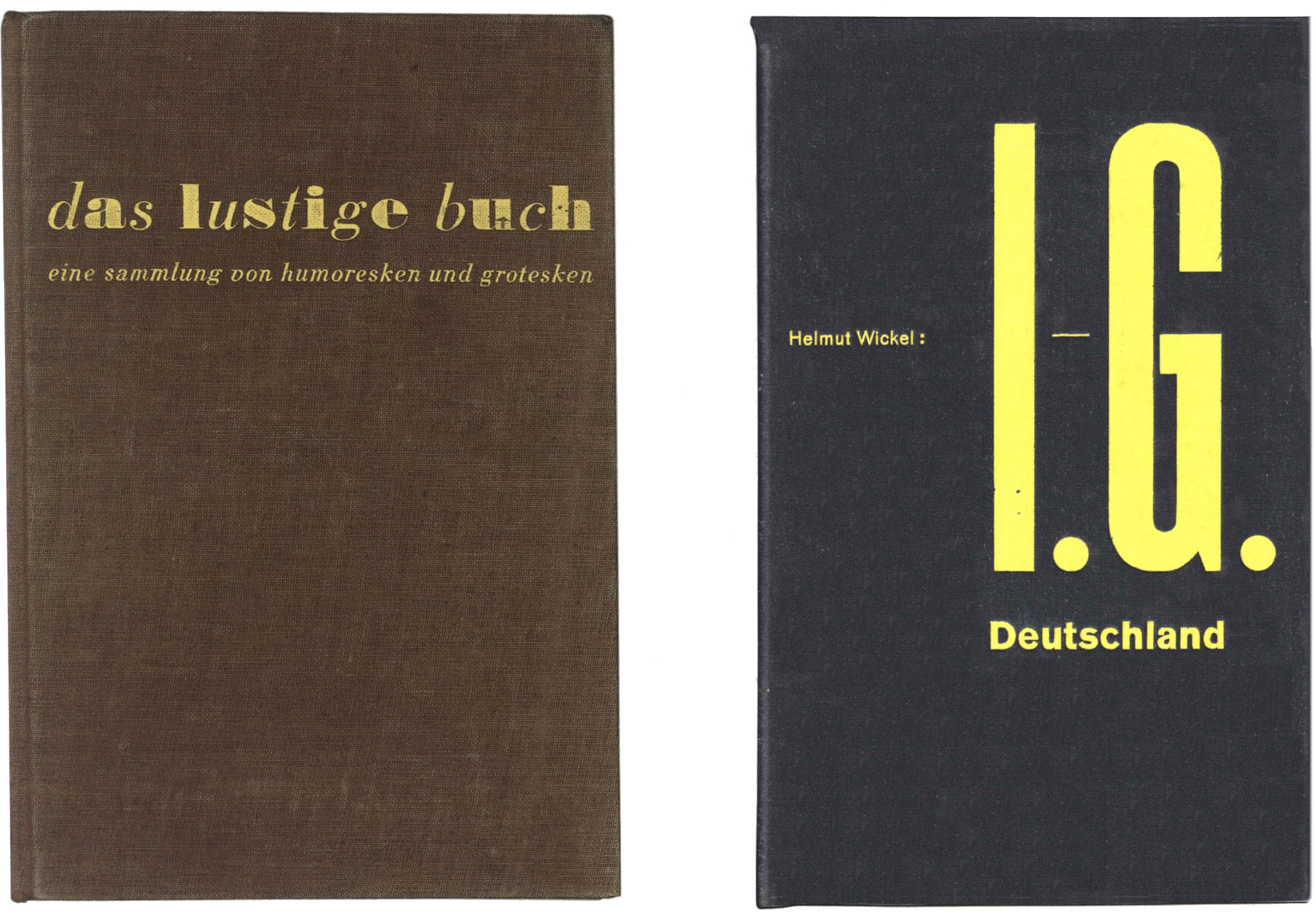
Das lustige Buch, book cover by Jan Tschichold, 1931, Verlag der Bucherkreis GmbH, Berlin (19.2 x 12.8 cm). / Helmut Wickel JG-Deutschland, book cover by Jan Tschichold, 1932, Verlag der Biicherkreis GmbH, Berlin (22.5 x 14 cm).
What is New Typography and what are its aims?: Jan Tschichold
The endeavours of some young designers, principally from Germany, the Soviet Union, the Netherlands, Czechoslovakia, and also Switzerland and Hungary, are being gathered under the single term of ‘New Typography’. The beginnings of these endeavours in Germany reach back to the war period. One can see the existence of New Typography as the outcome of the personal work of its originators; it seems to me more correct however to consider them more as exponents of movements of the time and of actual necessity (which does not in any way mean that the creative achievements and the local innovations of the initiators should be devalued).
The movement would never have experienced the spread that it now has, uncontested, in Central Europe, if it had not matched present-day practical necessities. It meets these in such an exceptional way because the programme of New Typography demands first of all the unprejudiced adjustment of typography to whatever is the task at hand.
It is necessary to describe briefly the state of typographic development before the war. After the stylistic confusion of the 1880s, the Arts & Crafts movement followed, emanating from England (Morris, 1892); at least in the domain of typography it was predominantly historicist in orientation (imitation of incunables).
Later (around 1900) ‘Jugendstil’ attempted, without lasting success, to free design work of all historical models. With a misconceived copying of natural forms (Eckmann), finally even with a renewed Biedermeier (Wieynck), Jugendstil ended up as a new historicism. Historical models were discovered yet again and imitated, albeit with better understanding (German book art, 1911–1914–1920). This more intensive study gave rise to a new adoration of historical form and resulted of course in a limitation of creative freedom, which ended in paralysis. The most important achievement of these years was — against expectations — the rediscovery of old typefaces (Walbaum, Unger, Didot, Bodoni, Garamond, and so on), which have for some time already have been rightly preferred to their ‘forerunners’, in reality their imitators.
Let us look at the principles that were followed in the pre-war typography. The majestic historical model knew only one scheme of composition: the central axis and axial arrangement, whose clearest case was the title-page. Every kind of typography used this scheme, no matter what the nature of the job was — whether newspapers or brochures, letterheadings or advertisements. It was only after the war that a dark secret was revealed: that different tasks with quite different practical requirements could be resolved creatively.
The natural reaction to the stiffness of pre-war typography was New Typography, which brought a loosening of design methods to the task.
For any typographic work one can discern two parts of the job: recognition and fulfilment of practical demands — and the visual design, which is a matter of aesthetics. (It is useless to want to avoid this term.)
In this typography is quite different from architecture. In very many cases the visual form of a new house can be — and, by the best architects, is — derived completely from the practical demands on it; but in typography, apart from a few exceptions, an aesthetic dimension of the design process is clearly evident. This circumstance puts typography nearer to the domain of ‘free’ spatial design (painting and graphic art) than to that of architecture. In typographic and free graphics or painting it is always a matter of spatial design. One can understand from this why it is that these new painters — the ‘abstractionists’— had to be the discoverers of New Typography. It would be too much of a detour here to add an account of the new painting: one only has to look at the exhibitions of abstract painting to see the obvious connections between this painting and New Typography. This connection is not, as some think — those who have not understood abstract painting either — a formalistic one; rather it is a genetic one. Abstract paintings are ‘purpose-free’, designed relations of pure colours and forms, without literary admixtures. Typography means visual (or aesthetic) order of given elements (= practical demands, type, image, colours, etc.) in a space. The difference between painting and typography is just that in painting the elements are left to free choice and the resulting picture serves no practical purpose. The typographer can do no better than take up an intensive study of spatial design, as one finds it in abstract painting.
The speed of modern communication also compels the most exact calculation of the amount of text, for greater economy of design. Typography had to find forms that were simpler and clearer than centred title-page designs, and at the same time to design these in a way that was visually more stimulating and more varied. In France Guillaume Apolinaire with his Calligrammes, in Italy Marinetti with Les mots en liberté futuristes (1919), in Germany the Dadaists all gave impulse to the new development of typography. Dadaism is still regarded by many, who haven’t taken the trouble to look into its motivation, as pure madness; only a later age will properly value the pioneer work of the circle of Hausmann, Heartfield, Grosz, Hulsenbeck, and others. In any event, the pamphlets and writings of the Dadaists (which date from the war years) are the earliest documents of New Typography in Germany. Around 1922, the movement widened as some abstract painters made typographic experiments. The special number of Typographische Mitteilungen, Elementare Typographie (printed in an edition of 28,000 copies), edited by the author in 1925, contributed to the further effect in which these endeavours, brought together for the first time, were made known to the broad mass of compositors. At first the aims of New Typography were strongly attacked from almost all sides, but now, apart from a few ill-tempered people, no-one thinks of disputing the New. New Typography has prevailed.
If one wants to differentiate New Typography from what went before, it appears that the main characteristic is a negative: it is not historicizing. The blame for this negative description is its rival, which was exactly historically oriented. In fact New Typography is not so much anti-historical as un-historical, because it knows no formalistic limitations. The liberation from historical handcuffs brings complete freedom in the choice of means. To enrich typographic design, one can, for example, use all historical and ahistorical types, all kinds of spatial organization, all directions of line. The goal is only design: purposefulness and creative ordering of the visual elements. So limits, such as the demand for unity of type, admissable and forbidden mixtures of types, are not drawn. It is also wrong to propose some tranquility of appearance as the single aim of design — there is also designed unrest. As well as its ahistorical focus, New Typography is characterized by its preference for new technical processes. Thus:
type not drawn letters
machine composition not hand-setting
photography not drawing
process blocks not woodcuts
machine-made paper not hand-made paper
powered presses not handpresses
etc.
and also:
standardization not individualization
cheap books not private-press editions
active literature not passive leather-bindings
Through its design methods New Typography encompasses the whole sphere of printing, not just the more narrow domain of typesetting. So for example with photography we have an objective process of graphic reproduction that is open to anyone. Photography is, along with type, another means of visual language.
The working method of New Typography rests on the clear identification of purpose and the best way of fulfilling it. However beautiful a piece of modern typography may be, it is not ‘new’ if it sacrifices the purpose of its form for this. Form is a consequence of the work and not the realization of some external formal conception. This necessary truth goes unrecognized by a whole crowd of quasi-modernists. The nearest possible attainment of purpose is the highest demand of New Typography. Thus the shedding of all decorative additions becomes self-evident. And — this cannot be stressed enough — really good legibility is also part of purpose. Lines of text that are too short or lines that are long and too little leaded are hard to read and thus to be avoided from the outset. The correct application of various new printing processes almost always produces specific forms, which it should be one of the typographer’s tasks to recognize and design with. Good typography is not conceivable without a thorough knowledge of technical conditions.
The number of printed things that concern any individual, and of which he will receive an often considerable part, demands the application of standardized formats.
Of the basic repertoire of types, the grotesque (sanserif) is closest to New Typography, because it is simply designed and has good legibility. The use of other legible and also historical types — in a new sense — is quite possible if the letterform has been evaluated against that of other types present, i.e. if the visual tensions between them have been designed. So this is not to demand that everything be set in grotesque, even if grotesque may be the most appropriate choice for a large number of printed items. Many applications are available in the different variants of this letterform (light, semibold, bold, thin, wide, narrow, spaced, etc.), and in juxtaposition this can result in rich and differentiated contrast. Another kind of contrast comes from using roman types together (Egyptienne, Walbaum, Garamond, italics, etc.), and there can be no objection to making use of this specific effect. (Another very particular and effective letterform is typewriter type.)
Typographic design is the best ordering and correct choice of type sizes, according to their place within the logical structure of the text (this can be heightened or played down). The conscious use of movement (through type, and occasionally a thick or thin rule or aggregation of rules), the visually judged contrast of small and large, thin and thick, narrow and expanded types; grey and coloured areas, inclined and horizontal, limited and open groups, and so on, are further means of design. They represent the ‘aesthetic’ aspect of typographic design. Within definite boundaries, drawn up by practical purpose and logical structure, one can often take very different routes, so that from there on the visual sense of the typographer is decisive. This becomes apparent when several designers are given the same job: as many different solutions follow, each probably with almost the same advantages. Essentially the same means thus encounter an extraordinary number of possibilities of application. These examples also show that modern means do not, as is often thought, entail a flattening of expression — on the contrary, the results are essentially more differentiated and above all more original than the typography of the pre-war years.
Colour is another part of the repertoire, like typeface. In a sense, colour should be seen alongside the unprinted space — the discovery of which is to be counted among the achievements of the young forces in typography. White space is to be regarded as an active element, not a passive background. Red is to be preferred among available colours; it is the colour in making the greatest contrast to normal black. The clear tones of yellow and blue take their place in the front rank, just because they are clear and simple. Colours are not to be used as decorative, ‘beautifying’ extras, rather one uses the characteristic psycho-physical properties of each colour as means to enhance, or diminish, an effect.
The image is produced by photography. The object is in this way reproduced at its most objective. Whether photography may or may not be an ‘art’ is not of importance here; its connection with type and space can be art, because here the criteria are merely those of structural contrast and visual relationships. Many people regard drawn images with distrust; the often false drawings of earlier times are no longer convincing and their individualistic manner is no longer attractive. The wish to present several images simultaneously, juxtaposing and contrasting different things, led to the origination of photomontage. Just the same general methods of design apply here as for typography; in conjunction with typography, the aggregate of photographs becomes part of the whole; so it has also to be correctly judged in this connection, to result in a harmonious design. The designed juxtaposition of typography and photography (or photomontage) is termed typophoto. A rare, but very rich possibility in photography is the photogram. A photogram is made without a camera, simply by placing an object — somewhat transparent or not — on a light-sensitive surface (paper, film or plate).
The extraordinary adaptability of New Typography to any conceivable purpose makes it an essential phenomenon of our time. It is not a matter of fashion; rather it can be used as the foundation of all future work in typography.
Karel Teige (Prague) has summarized the main features of New Typography:
Constructivist typography* means and requires:
1. The liberation from tradition and prejudice: overcoming of archaism and academicism and elimination of any decorativism. Disrespect for academic and traditional rules that cannot be supported on visual grounds, but which are merely rigid forms (Golden Section, unity of type).
2. Selection of types of completely clear legibility and geometrically simple design, understanding for the spirit of types and the use of them in accordance with the nature of the text: contrast in the typographic material for the purpose of greater emphasis of content.
3. Complete fulfilment of the purpose of the job. Differentiation of special needs. Posters, which need to be readable from a distance, pose demands that are different from those of a scientific book, which are different again from poetry.
4. Harmonic balancing of the surface and of the type-area, according to visually objective principles; comprehensible structure and geometric organization.
5. Exploitation of all possibilities that are offered by past and future technical discoveries; union of image and type through typophoto.
6. The closest collaboration of the graphic designer with the people in the printing house is to be desired, just as between an architect and the builders, and between the employer and those carrying out the job; this requires equally specialization and division of work and the closest contact.
We have nothing to add to this statement, apart from saying that the Golden Section, like other definite ratios of measurement, is often more memorable than arbitrary relationships, and so should not be completely ruled out.
Notes
* A term for New Typography.
Translated by Robin Kinross from ‘Was ist und was will die neue Typografie?’ introduction to Eine Stunde Druckgestaltung (1930).