
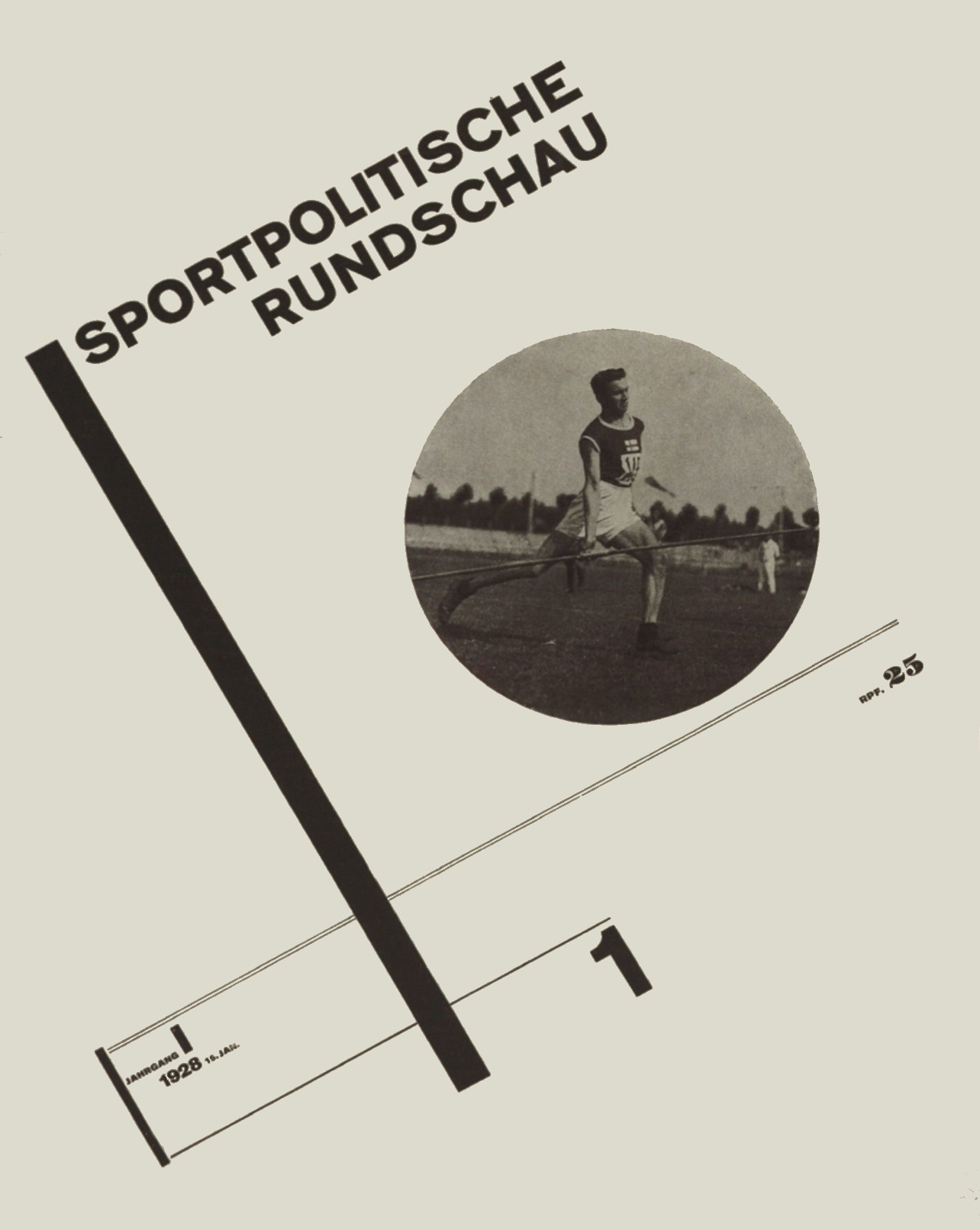
Sportpolitische Rundschau, magazine cover by Jan Tschichold, 1928, (31 x 23.7 cm).
Symmetrical or Asymmetrical Typography?: Jan Tschichold
The question, asked in this form, demands an explanation first. The word symmetrical may not be used when we talk about a typographical arrangement, because something is symmetrical only if one half is the mirror image of the other half. Originally, the word meant balance in general. Over time the meaning has narrowed down to that mentioned above. Strictly symmetrical things do not necessarily have to be ugly, but they are rarely beautiful. If we remember an old clothes chest with a real keyhole on the right and a false one on the left side: there was a time when the false keyhole would have been missed.
Because the left half of a centered title or even of a single line is not the mirror image of the right half, in the strictest sense the entire composition is not symmetrical. There is no such thing as symmetrical typography. When the lines are justified towards the middle, we should call it centered typography. Not to mention that there is no such thing as a center axis, and therefore no center axis typography either. The phrase center axis is a tautology. An axis is always the pivot of that which turns around it, even if the structure itself is not symmetrical.
A frame around typeset matter is symmetrical as a rule, but it is an addition that need not be discussed here. Countless natural forms appear symmetrical: the human shape, the animal, a plant seed and an egg. Others develop towards general symmetry: a free-standing tree for instance.
The symmetrical appearance of a human being is reflected in the symmetrical shape of a book and even in a book title, where the lines have been centered. Similarly, the symmetrical architecture of the Renaissance is a response to the symmetrical appearance of man. In itself, a symmetrical arrangement is neither the mark of a particular style nor the expression of society, but rather a shape that grew almost naturally, a form that has been around at all times and in the most diverse societies. It is a visible effort toward order, toward a center; that is all it attests to.
What is it that causes so many symmetrical and quasi-symmetrical shapes to appear beautiful to our eyes? Empty, a Rococo park, with its strict regularity, is unbearably stilted and dreary. Let a human being or a couple stroll around in it and the contrast between geometrical strictness and living movement brings it to life and renders the whole very pleasant.
A human being looks symmetrical from the outside, but the two halves of his face are never really symmetrical; more often than not, they are quite different. This difference is, at minimum, expressive and at times the real cause of beauty. A pebble gives us pleasure when it rolls like a ball. Expression and life mean motion. Immobile symmetry holds no tension and leaves us cold.
A richly decorated Baroque picture frame, or any other symmetrically structured ornamental border that appears beautiful to our eyes, may achieve this effect only because the motion inherent in the ornamentation disturbs the otherwise static picture.
Indeed, disturbance of perfect symmetry is one of the prerequisites for beauty. Anything not quite symmetrical is considerably more beautiful than faultless symmetry. In art, a nude is never portrayed standing at attention, but rather in a non-symmetrical position; this disarrangement of symmetry is indispensable.
In the same way, a quasi-symmetrical book title is beautiful and full of expression thanks to the subconsciously perceived tension between the asymmetrical word images and lines and the desire to enfold these elements and bind them to a symmetrical order. On the other hand, the appearance of perfectly symmetrical and static letters like A H M T V within the otherwise dynamically ordered typography on a page provides a pleasant retarding force.
Even a fluctuation between apparent symmetry and dynamic order can at times be gratifying, in a magazine, for instance; but to achieve this, a large measure of masterful certainty is required. There is no prescription that automatically produces art. Recent examples from the job-printing market demonstrate that a naturally centered typography may be abused and forced to assume attitudes of vanity, which are alien to printing. The result is no more than a fashionable craze.
Typography is a servant, not a master; the right gesture is invariably defined by expediency. It is therefore not inconsistent, and frequently advisable, to begin a book with a centered title and to place the chapter headings also in the middle. Subheadings, then, may be moved to the left.
As we can see, there is no real disparity between apparently symmetrical typography and the uncentered kind. What we have instead is a wide range of efforts that result in typography where either a centered composition or a dynamic one dominates. These arrangements and all their varieties may be suitable for the job at hand, or they may not. We can only hope that the results in each case are beautiful.
Translated by Hajo Hadeler. Jan Tschichold: The Form of the Book: Essays on the Morality of Good Design Lund Humphries, London, 1991