
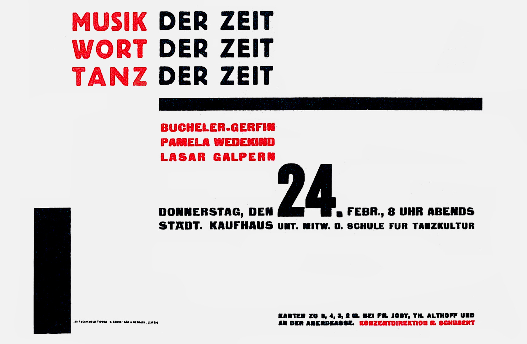
Jan Tschichold, Typographic poster for a concert. Red and black on silver. 1928
The Principles of the New Typography: Jan Tschichold
Modern man has to absorb every day a mass of printed matter which, whether he has asked for it or not, is delivered through his letter-box or confronts him everywhere out of doors. At first, today’s printing differed from that of previous times less in form than in quantity. But as the quantity increased, the “form” also began to change; the speed with which the modern consumer of printing has to absorb it means that the form of printing also must adapt itself to the conditions of modern life. As a rule we no longer read quietly line by line, but glance quickly over the whole, and only if our interest is awakened do we study it in detail.
The old typography both in feeling and in form was adapted to the needs of its readers, who had plenty of time to read line by line in a leisurely manner. For them, function could not yet play any significant role. For this reason the old typography concerned itself less with function than with what was called "beauty" or “art." Problems of formal aesthetics (choice of type, mixture of typefaces and ornament) dominated considerations of form. It is for this reason that the history of typography since Manutius is not so much a development towards clarity of appearance (the only exception being the period of Didot, Bodoni, Baskerville, and Walbaum) as an embodiment of the development of historical typefaces and ornaments.
It was left to our age to achieve a lively focus on the problem of “form" or design. While up to now form was considered as something external, a product of the "artistic imagination" (Haeckel even imputed such “artistic intentions” to nature in his Art Forms in Nature), today we have moved considerably closer to the recognition of its essence through the renewed study of nature and more especially to technology (which is only a kind of second nature). Both nature and technology teach us that “form” is not independent, but grows out of function (purpose), out of the materials used (organic or technical), and out of how they are used. This was how the marvellous forms of nature and the equally marvellous forms of technology originated. We can describe the forms of technology as just as “organic” (in an intellectual sense) as those of nature. But as a rule most people see only the superficial forms of technology, they admire their “beauty” – of aeroplanes, cars, or ships —instead of recognizing that their perfection of appearance is due to the precise and economic expression of their function.
In the process of giving form, both technology and nature use the same laws of economy, precision, minimum friction, and so on. Technology by its very nature can never be an end in itself, only a means to an end, and can therefore be a part of man's spiritual life only indirectly, while the remaining fields of human creativity rise above the purely functional of technical forms. But they too, following the laws of nature, are drawn towards greater clarity and purity of appearance. Thus architecture discards the ornamental facade and “decorated” furniture and develops its forms from the function of the building — no longer from the outside inwards, as determined by the facade-orientation of pre-wartime days, but from the inside outwards, the natural way. So too typography is liberated from its present superficial and formalistic shapes, and from its so-called “traditional” designs which are long since fossilized. To us, the succession of historic styles, reactions against Jugendstil, are nothing but proof of creative Incompetence.
It cannot and must not be our wish today to ape the typography of previous centuries, itself conditioned by its own time. Our age. with its very different aims, its often different ways and means and highly developed techniques, must dictate new and different visual forms. Though its significance remains undeniable, to think today that the Gutenberg Bible represents an achievement that can never again be reached is both naive and romantic rubbish. If we want to "prove ourselves worthy” of the clearly significant achievements of the past, we must set our own achievements beside them born out of our own time. They can only become “classic” if they are unhistoric.
The essence of the New Typography is clarity. This puts it into deliberate opposition to the old typography whose aim was "beauty” and whose clarity did not attain the high level we require today. This utmost clarity is necessary today because of the manifold claims for our attention made by the extraordinary amount of print, which demands the greatest economy of expression. The gentle swing of the pendulum between ornamental type, the (superficially understood) "beautiful" appearance, and "adornment" by extraneous additions (ornaments] can never produce the pure form we demand today. Especially the feeble clinging to the bugbear of arranging type on a central axis results in the extreme inflexibility of contemporary typography.
In the old typography, the arrangement of individual units is subordinated to the principle of arranging everything on a central axis. In my historical introduction I have shown that this principle started in the Renaissance and has not yet been abandoned. Its superficiality becomes obvious when we look at Renaissance or Baroque title-pages. Main units are arbitrarily cut up: for example, logical order, which should be expressed by the use of different type-sizes, is ruthlessly sacrificed to external form. Thus the principal line contains only three-quarters of the title, and the rest of the title, set several sizes smaller, appears in the next line. Such things admittedly do not often happen today, but the rigidity of central-axis setting hardly allows work to be carried out with the degree of logic we now demand. The central axis runs through the whole like an artificial, invisible backbone: its raison d’être is today as pretentious as the tall white collars of Victorian gentlemen. Even in good central-axis composition the contents are subordinated to “beautiful line arrangement." The whole is a "form" which is predetermined and therefore must be inorganic.
We believe it is wrong to arrange a text as if there were some focal point in the centre of a line which would justify such an arrangement. Such points of course do not exist, because we read by starting at one side (Europeans for example read from left to right, the Chinese from top to bottom and right to left). Axial arrangements are illogical because the distance of the stressed, central parts from the beginning and end of the word sequences is not usually equal but constantly varies from line to line.
But not only the preconceived idea of axial arrangement but also all other preconceived ideas – like those of the pseudo-constructivists – are diametrically opposed to the essence of the New Typography. Every piece of typography which originates in a preconceived idea of form, of whatever kind, is wrong. The New Typography is distinguished from the old by the fact that its first objective is to develop its visible form out of the functions of the text. It is essential to give pure and direct expression to the contents of whatever is printed: just as in the works of technology and nature, “form” must be created out of function. Only then can we achieve a typography which expresses the spirit of modern man. The function of printed text is communication, emphasis (word value), and the logical sequence of the contents.
Every part of a text relates to every other part by a definite, logical relationship of emphasis and value, predetermined by content. It is up to the typographer to express this relationship clearly and visibly, through type sizes and weight, arrangement of lines, use of colour, photography, etc. The typographer must take the greatest care to study how his work is read and ought to be read. It is true that we usually read from top left to bottom right – but this is not a law. It is shown at its clearest in Willi Baumeister’s invitation card. There is no doubt that we read most printed matter in successive steps: first the heading (which need not be the opening word) and then, if we continue to read the printed matter at all, we read the rest bit by bit according to its importance. It is therefore quite feasible to start reading a text at a different point from the top left. The exact place depends entirely on the kind of printed matter and the text itself. But we must admit that there are dangers in departing from the main rule of reading from the top to the bottom. One must therefore, in general, not set a following body of text higher than the preceding one – assuming that the arrangement of the text has a logical sequence and order.
Working through a text according to these principles will usually result in a rhythm different from that of former symmetrical typography. Asymmetry is the rhythmic expression of functional design. In addition to being more logical, asymmetry has the advantage that its complete appearance is far more optically effective than symmetry.
Hence the predominance of asymmetry in the New Typography. Not least, the liveliness of asymmetry is also an expression of our own movement and that of modern life; it is a symbol of the changing forms of life in general when asymmetrical movement in typography takes the place of symmetrical repose. This movement must not however degenerate into unrest or chaos. A striving for order can, and must, also be expressed in asymmetrical form. It is the only way to make a better, more natural order possible, as opposed to symmetrical form which does not draw its laws from within itself but from outside.
Furthermore, the principle of asymmetry gives unlimited scope for variation in the New Typography. It also expresses the diversity of modern life, unlike central-axis typography which, apart from variations of typeface (the only exception), does not allow such variety.
While the New Typography allows much greater flexibility in design, it also encourages "standardization" in the construction of units, as in building. The old typography did the opposite: it recognized only one basic form, the central-axis arrangement, but allowed all possible and impossible construction elements [typefaces, ornaments, etc.).
The need for clarity in communication raises the question of how to achieve clear and unambiguous form.
Above all. a fresh and original intellectual approach is needed, avoiding all standard solutions. If we think clearly and approach each task with a fresh and determined mind, a good solution will usually result.
The most important requirement is to be objective. This however does not mean a way of design in which everything is omitted that used to be tacked on, as in the letterhead "Das politische Buch" shown here. The type is certainly legible and there are no ornaments whatever. But this is not the kind of objectivity we are talking about. A better name for it would be meagerness. Incidentally this letterhead also shows the hollowness of the old principles: without “ornamental" typefaces they do not work.
And yet, it is absolutely necessary to omit everything that is not needed. The old ideas of design must be discarded and new ideas developed. It is obvious that functional design means the abolition of the "ornamentation" that has reigned for centuries.
The use of ornament, in whatever style or quality, comes from an attitude of childish naivety. It shows a reluctance to use "pure design," a giving – in to a primitive instinct to decorate – which reveals, in the last resort, a fear of pure appearance. It is so easy to employ ornament to cover up bad design! The important architect Adolf Loos, one of the first champions of pure form, wrote already in 1898: "The more primitive a people, the more extravagantly they use ornament and decoration. The Indian overloads everything, every boat, every rudder, every arrow, with ornament. To insist on decoration is to put yourself on the same level as an Indian. The Indian in us all must be overcome. The Indian says: This woman is beautiful because she wears golden rings in her nose and her ears. Men of a higher culture say: This woman is beautiful because she does not wear rings in her nose or her ears. To seek beauty in form itself rather than make it dependent on ornament should be the aim of all mankind."
Today we see in a desire for ornament an ignorant tendency which our century must repress. When in earlier periods ornament was used, often in an extravagant degree, it only showed how little the essence of typography, which is communication, was understood.
It must be understood that “ornament” is not only decorated rules and printers’ flowers but also includes all combinations of rules. Even the thick/thin rule is an ornament, and must be avoided. (It was used to disguise contrasts, to reduce them to one level. The New Typography, on the other hand, emphasizes contrasts and uses them to create a new unity.)
"Abstract decorations" which some foundries have produced under different names are also ornaments in this sense. Unfortunately many people have thought the essence of the New Typography consists merely in the use of bold rules, circles, and triangles. If these are merely substituted for the old ornaments, nothing is improved. This error is forgivable since, after all, all former typography was oriented towards the ornamental. But that is exactly why the utmost care must be taken to avoid replacing the old floral or other ornamentation with abstract ornaments. Equally the New Typography has absolutely nothing to do with "pictorial" typesetting (Bildsatz) which has become fashionable recently. In almost all its examples it is the opposite of what we are aiming for.
But it is not enough to dispense with ornament in order to create a meaningful form. We have already seen that even the old form that dispenses with ornament is ineffective because it is still based on the effect of ornamental types. The form of the old typography could be taken in at a glance, even though this does not correspond with the reading process. Even if I succeed in recognizing the outline of the type matter I have not really read anything. Reading presupposes eye movement. The New Typography so designs text matter that the eye Is led from one word and one group of words to the next. So a logical organization of the text is needed, through the use of different type-sizes, weights, placing in relation to space, colour, etc.
The real meaning of form is made clearer by its opposite. We would not recognize day as day if night did not exist. The ways to achieve contrast are endless; the simplest are large/small, light/dark, horizontal/vertical, square/round, smooth/rough, closed/open, coloured/plain; all offer many possibilities of effective design.
Large differences in weight are better than small. The closer in size different types are to each other, the weaker will be the result. A limit to the number of type sizes used — normally three to not more than five — is always to be recommended. This has the additional advantage of being easier both in designing and in setting. Variations in size should be emphatic: it is always better for the headline to be very large and the remaining text noticeably smaller.
It is vital that all contrasts, for example in type sizes, should be logical. For example, a forename should not have a much larger initial letter if the beginning of the principal name is not specially indicated. All form must correspond with meaning and not contradict it.
In asymmetric design, the white background plays an active part in the design. The typical main display of the old typography, the title-page, showed its black type on a white background that played no part in the design. In asymmetric typography, on the other hand, the paper background contributes to a greater or lesser degree to the effect of the whole. The strength of its effect depends on whether it is deliberately emphasized or not; but in asymmetric design it is always a component. The New Typography uses the effectiveness of the former “background" quite deliberately, and considers the blank white spaces on the paper as formal elements just as much as the areas of black type. In this way the New Typography has enriched the art of printing by giving it a new medium of expression. The powerful effect in many examples of the New Typography depends directly on the use of large areas of white: white is always stronger than grey or black. Strong contrasts between white and black, in the form of type or rules, emphasize the white areas and greatly assist the total effect.
A common misunderstanding of what we are about can be seen when the area of white has been decided beforehand and the text compressed into it. It is equally wrong to suppose that areas of white are ever more important than the words of the text.
When the design of a piece of typography is looked at — and all typography has a design, of varying nature and quality – modern typography is distinguished by its formal use of the white and black areas. Of course, logically only the type is important.
The pursuit of greater effectiveness and clarity in the relationship between black and white areas often leads to a noticeable reduction of margins (always prominent in the old typography). In the New Typography margins often almost entirely disappear. Of course type cannot in most cases be set right up to the edge of the paper, which would hinder legibility. In small items of printed matter, 12 to 24 points are the minimum margin required; in posters 48 points. On the other hand, borders of solid red or black can be taken right up to the edge, since unlike type they do not require a white margin to achieve their best effect. Blocks too can be bled off the page provided the trim is accurate.
Colour
In contrast with the old typography, in which colour as well as form was always used decoratively, in the New Typography colour is used functionally i.e. the physiological effect peculiar to each colour is used to increase or decrease the importance of a block of type, a photograph, or whatever. White, for example, has the effect of reflecting light; it shines. Red comes forward, it seems closer to the reader than any other colour, including white. Black on the other hand is the densest colour and seems to retire the furthest. Of the other colours, yellow, for example, is close to red, and blue to black. (We do not accept a “literary" identification of colours, for example red = love, yellow = envy, as not being natural.)
We have today a strong feeling for light, therefore for white, which explains its importance in the New Typography. The liveliness of red corresponds to our own natures, and we prefer it to all other colours. The already strong contrast between black and white can be greatly enhanced by the addition of red. (This is admittedly not a new discovery: but we have perhaps made sharper use of this combination than the earlier typographers, who also much enjoyed using black-red on white, especially in the Gothic and Baroque periods.)
The combination of black-red is of course not the only possibility, as is often mistakenly supposed, but it is often chosen because of its greater intensity. Colour should be used, in general, to help express the purpose of the work: a visiting-card does not require three colours, and a poster generally needs more than just black and white.
Pure red. yellow, and blue, unmixed with black, will generally be preferred, because of their intensity, but other mixed colours need not be excluded.
Type
None of the typefaces to whose basic form some kind of ornament has been added (serifs in roman type, lozenge shapes and curlicues in fraktur) meet our requirements for clarity and purity. Among all the types that are available, the so-called “Grotesque" (sanserif) or “block letter" ("skeleton letters" would be a better name) is the only one in spiritual accordance with our time.
To proclaim sanserif as the typeface of our time is not a question of being fashionable, it really does express the same tendencies to be seen in our architecture. It will not be long before not only the “art" typefaces, as they are sometimes called today, but also the classical typefaces, disappear, as completely as the contorted furniture of the eighties.
There is no doubt that the sanserif types available today are not yet wholly satisfactory as all-purpose faces. The essential characteristics of this type have not been fully worked out: the lower-case letters especially are still too like their “humanistic" counterparts. Most of them, in particular the newest designs such as Erbar and Kabel, are inferior to the old anonymous sanserifs, and have modifications which place them basically in line with the rest of the "art" faces. As bread-and-butter faces they are less good than the old sans faces. Paul Renner’s Futura makes a significant step in the right direction.
But all the attempts up to now to produce a type for our time are merely “improvements" on the previous sanserifs: they are all still too artistic, too artificial, in the old sense, to fulfil what we need today.
Personally I believe that no single designer can produce the typeface we need, which must be free from all personal characteristics: it will be the work of a group, among whom I think there must be an engineer.
For the time being it seems to me that the jobbing sanserifs, like those from Bauer & Co. in Stuttgart, are the most suitable for use today, because of their functionalism and quiet line. Less good is Venus and its copies, owing to the bad design of caps E and F and the lower-case t with its ugly slanted crossbar. In third place, when nothing better is available, come the "painterly" (malerischen) block letters (light and bold, etc.) with their seemingly gnawed-off edges and rounded finials. Of the roman types, the bold romans (the Aldine, and bold Egyptians), with their exact drawing, are best, as far as types for emphasis are required.
The essential limitation of this restricted range of typefaces does not mean that printers who have no or too few sanserif faces cannot produce good contemporary typography while using other faces. But it must be laid down that sanserif is absolutely and always better. I am aware that to lay down the law like this will offend the romantic predilections of a large part of the printing trade and the public for the old "decorative" faces. These old types can however from time to time find a new use in modern typography: for fun, for example in order to make a typographical parody of the “good old days"; or as an eye-catcher — for example by using a bold fraktur B in the middle of sanserif —just as the pompous uniforms of Victorian generals and admirals have been degraded for flunkeys and fancy dress. Whoever is so attached to fraktur — this sixteenth-century clerk’s type — that he can not let go of it, should also not do violence to it by using it in modern typography where it can never be comfortable. Fraktur, like gothic and Schwabacher, has so little to do with us that it must be totally excluded as a basic type for contemporary work.
The emphatically national, exclusivist character of fraktur – but also of the equivalent national scripts of other peoples, for example of the Russians or the Chinese – contradicts present-day transnational bonds between people and forces their inevitable elimination.1 To keep to these types is retrograde. Roman type is the international typeface of the future. These important changes must come, since they express the actual spirit of our age and are required by the technical forms of the present and indeed the future. As undesirable as fraktur are those roman types with extraordinary forms, such as script and decorated, like Eckmann and others. The details of these faces distract from the meaning and thus contradict the essence of typography. which is never an end in itself. Their use for parody, in the sense described above, of course remains legitimate.
As a bread-and-butter type today’s sanserifs are only partially suited. A bolder face is out of the question because continuous reading matter in bold sanserif is not easy to read. I find the best face in use today is the so-called ordinary jobbing sanserif, which is quiet and easy to read. In using it for this book I wanted to show how readable it is; but I still have certain reservations. However it is preferable to all the romans. (In the particular choice of type for this book I was limited to what the printer held.)
The main reason why sanserif is so seldom used today for normal text setting is that in general there is not enough of it available. So for much printed matter and books like the present one. entirely set in sanserif, it will remain the exception. In such cases the text face will be a good roman, and sanserif will be reserved for emphasis.
Even more than the historic typefaces, the "artists’” typefaces are disturbing because of their strongly individual character, which is in direct opposition to the spirit of our age and makes them unsuitable for properly designed printing today. No period was so preoccupied with individualism as that from the beginning of the present century up to the outbreak of war. The “artists’" types of this period reached their lowest point. None are in any way better than their predecessors, which are preferable for their superior quality.
Nevertheless the classic faces like Walbaum, Didot, Bodoni, etc. cannot serve as bread-and-butter types today. In terms of their conception they possess romantic associations, they divert the reader’s attention into certain emotional and intellectual spheres and clearly belong to a past with which we have no connection. A natural development — not a forced one — would hardly have brought them back again.
To my mind, looking at the modern romans, it is the unpretentious works of the anonymous type-designers that have best served the spirit of their age: Sorbonne, Nordische Antiqua, Französische Antiqua, and so on. These three typefaces and their derivatives are the best designs from the pre-war period.2 They are easily legible; they are also above all in a technical sense useful and free from personal idiosyncrasies — in the best sense of the word, uninteresting. They can therefore be used everywhere, when a roman type has to be used because no appropriate sanserif is available.
On the expressiveness of type
Those who claim that sanserif is the typeface of our own age are often told that it does not express anything. Do other typefaces express anything? Is it really a typeface’s job to express spiritual matters? Yes and no. The widely held belief that every typeface has some “spiritual” content is certainly not true of either gothic type (textura) or sanserif. The enormous number of typefaces available today, which express only an absence of creativity and are the result of the feebly eclectic nature of the pre-war period, may lead to the erroneous conclusion that gothic type expresses peace, solemnity and religion, and italic, on the contrary, expresses cheerfulness and joy. However, all the innumerable things that can be expressed in writing, of whatever kind, at any time, are set down in one — or at most two — kinds of lettering or type. Yes, the character of gothic is religious and solemn, that of rococo (as far as the wealthy class is concerned) is light-hearted, but the typography of those times, even when expressing something contrary to the "Zeitgeist,” is always logical and stylistically consistent. In the Gothic period even profane texts were set in texture, and in the Rococo period an invitation to a funeral looks in no way different from any light-hearted printed matter of the same period.
All lettering, especially type, is first and foremost an expression of its own time, just as every man is a symbol of his time. What textura and also rococo type express is not religiosity, but the Gothic, not cheerfulness, but the Rococo: and what sanserif expresses is not lack of feeling but the twentieth century! There is no personal expression of the designer, nor was it ever his aim, except in the first years of our century. The different kinds of type get their character from the different ideas of form in every age. Every punch-cutter wished to create the best possible typeface. If Didot did something different from Fleischmann, it was because times had changed, not because he wanted to produce something "special." "personal.” or "unique.” The conception of what a good typeface should look like had simply changed.
The eclectic nature of the pre-war period led people to play with typefaces of every period, thus revealing their own artistic poverty. A book about the Thirty Years’ War had to be set in a different face from Morike’s poems or an industrial catalogue. But St Augustine was set in textura, not in uncial! All printed matter of whatever kind that is created today must bear the hall mark of our age. and should not imitate printed matter of the past. This applies not only to the typeface but of course to every element of the manufacture: the illustrations, the binding, etc. Earlier periods, unlike us ever conscious of themselves, always denied the past, often very crudely; that can be seen in the building of cathedrals, in the general development of culture, and in typography. The punch-cutter Unger, creator of Unger-fraktur (c. 1800) and a famous typographer, declared that Schwabacher was an ugly type and introduced letter-spacing for emphasis in fraktur (previously. Schwabacher had been used for emphasis in fraktur). He was absolutely right. His age, the Rococo, found that gothic, and its ways of expression, including Schwabacher, were out of harmony with their own times, and hence ugly: Unger was merely its mouthpiece in our field of typography.
An art historian may prize the good qualities of the old Schwabacher type, and we too can see that it was an excellent face of its period, but we must not use it today, it is totally unsuitable for the 20th century. So are all the other historical typefaces.
Like everyone else, we too must look for a typeface expressive of our own age. Our age is characterized by an all-out search for clarity and truth, for purity of appearance. So the problem of what typeface to use is necessarily different from what it was in previous times. We require from type plainness, clarity, the rejection of everything that is superfluous. That leads us to a geometric construction of form. In sanserif we find a type that comes very close to these requirements, so it must become the basis for all future work to create the typeface of our age. The character of an age cannot be expressed only in rich and ornamental forms. The simple geometric forms of sanserif express something too: clarity and concentration on essentials, and so the essence of our time. To express this is important. But it is not important to create special types for advertising perfume manufacturers and fashion shops, or for lyrical outpourings by poets. It was never the task of punch-cutters of the past to create a type for a single kind of expression. The best typefaces are those which can be used for all purposes, and the bad ones those which can be used only for visiting-cards or hymn books.
A good letter is one that expresses itself, or rather “speaks.” with the utmost distinctiveness and clarity. And a good typeface has no purpose beyond being of the highest clarity.
Sanserif, looked at in detail, is admittedly capable of improvement, but there is no doubt that it is the basic form from which the typeface of the future will grow.
Other individual expressive possibilities of type have nothing to do with typography. They are in contradiction to its very nature. They hinder direct and totally clear communication, which must always be the first purpose of typography.
Orthography as at present or all in lower case?
In roman type and its simpler form, sanserif, we possess faces that have been made out of not one but two alphabets. This combination took place in the 15th century. The one alphabet, the capitals, known as majuscules, was made by the old Romans as a form shaped by the chisel, at the beginning of our era. The other alphabet, the small or lower-case letters, called minuscules, was made by the old Romans as a form shaped by the chisel, at the beginning of our era. The other alphabet, the small or lower-case letters, called minuscules, dates from the time of the emperor Charlemagne, about A .D . 800; the so-called Carolingian minuscule, a written letter made with a pen, with ascenders and descenders. This script too was originally complete in itself. The concept of “capital letters” was foreign to it. It was during the Renaissance that these two forms of letter, the roman capitals and the Carolingian minuscules, were combined to make one alphabet, the “Antigua” or “roman.” This is the explanation of the dichotomy, especially noticeable in German, between the capitals and the smaller letters. It is much less noticeable in other languages, especially French and English, because they use capital letters much less often than in German. Settings in roman type in English always look better than in German because they employ fewer accents and in particular do not use capitals for the first letters of nouns.
For a long time now there have been efforts to abolish the use of capital initial letters for nouns and make German writing conform with the international style. This signalling of nouns with capitals started in the Baroque period and seems to us now no longer useful. The rules governing our use of capitals make teaching at school more difficult and also present problems in later life because of the many exceptions. Jakob Grimm, one of the founders of German studies, advocated its abolition already a hundred years ago, and referred to the Old and Middle High German literature in which capitals were used only for proper names and beginnings of sentences. Following him, capitals have been used by Germanic scholars only in this way.
The aesthetic critic finds this mixture of two such differently designed faces unpleasing. For this reason many artists prefer to use capitals only, to avoid mixing them with lower case. In France recently there have been many examples of the independent use of lower case only (see the advertisement on this page) – mainly in fashion publicity and the announcements in fashion-shop windows. Besides the exclusive use of lower case for text can be seen the use of capitals alone for headings – and vice-versa, capitals for text and lower case for headings. From this one can see that it is now recognized that the two alphabets of roman are really two different styles, and should be used in parallel, but not mixed.
The New Typography does not accept either of these alternatives to the previous system — adjustment to the international writing method, or division of roman type into capitals and lower case and regarding them as separate alphabets, even if this is against current opinion. It accepts neither the view of the Germanists nor that of the artists following the eclectic French fashion. The New Typography demands economy in type design. To redesign our letters completely – as in shorthand and lettering for the blind – would be quite impractical and unacceptable. So we have to make do with the type we have, the capitals and the lower case. To decide which to choose is not difficult, because capitals in continuous text are too difficult to read. Lower-case letters are far easier to read, because of the ascenders and descenders which make complete words easier to recognize.
A completely one-type system, using lower case only, would be of great advantage to the national economy; it would entail savings and simplifications in many areas; and would also result in great savings of spiritual and intellectual energy at present wasted; we can mention here the teaching of writing and orthography, a great simplification in typewriters and typing technique, a relief for memory, type design, type-cutting, type-casting, and all composition methods – and so on.
At the same time as economic advantages, the use of minuscule would give us a stylistically faultless letter, so scientific advantage would be combined with aesthetic.
So there cannot be any change in orthography if it means abandoning the concept of capitals and lower case. We can go on using the small letters, only the use of capitals is discontinued. (A subsequent continuance of capitals in some special kinds of writing could be considered.)
But whether roman and also modern sanserif lower case can continue to express the opinions and claims of the present is open to doubt. Their form has always too much of writing and too little of type, and the efforts of the future will be directed towards suppressing their written character and bringing them closer to true print form.
German orthography if it is to be truly contemporary must see changes, which will undoubtedly influence typeface design. Above all we must lose the burden of too much heavy philology in linguistics, and provide our selves with self-explanatory signs for sch, ch. dg, drop the unnecessary letters (z. q. c) and aim at the rule “Write as you speak!" and its counter part “Speak as you write!” On this basis a new and more practical orthography could be achieved, without which literature cannot succeed.
Of course such a revolution in orthography and type will not happen in a day, but its time will assuredly come. Whether consciously or unconsciously, cultural developments take place and men change with them. The typeface of the future will not come from a single person but from a group of people.
It is significant that one of the best new books on speech, type, and orthography has been written not by an architect or a philologist but by an engineer: Sprache and Schrift (Speech and writing) by Dr W. Porstmann. Anyone interested in these problems will find this essential reading.
At the same time, while the New Typography regards the removal of capitals as desirable, it is not an absolute demand. But it lies, like a more logical design for our orthography, in our path: an unmistakable design for typography that is in harmony with the desires and demands of our time.
Mistakes often met
In the beginning, many saw a new formalism in the New Typography: that is, they adopted some of its most obvious features – circles, triangles, rules – as geometrical features and used them as if they were the old kinds of ornament. The "elementary ornaments" (itself a contradiction in terms) brought out by some foundries under various names further helped to spread this misunderstanding. These basic geometric forms which we like to use must however be functional: they must emphasize words or paragraphs or be justified by the formal harmony of the whole. But instead of this we still find truly childish, pseudo-constructive shapes, which are totally contradictory to the spirit of the New Typography.
The newspaper advertisement shown here is a typical example of pseudo constructivism, found all too commonly. Its form is not natural but comes from an idea before it was set. The advertisement is no longer typography but painting with letters, it turns good typography into borrowed, misunderstood, and thoughtless shapes.
A similar example is in the two-colour business announcement on this page. Again, a previously conceived and meaningless shape is used, which has no connection with the text or its logical arrangement and in fact conflicts with it. Another serious fault is the lack of contrast in colour, which emphasizes the bland and boring look of the whole.
The magazine cover on the facing page is an even worse example. It attemps to be "technical” but contradicts the whole nature of what actually is technical. Here we see the mixing-in of that “art” against which we are fighting — an artificiality which neglects truth and merely makes a “pretty shape” which fails to express the purpose of the design. Imagination must be used on the basis of actual purpose, if truth in design is to be achieved. (In painting it is different: no restrictions are laid down, because the work does not have a fixed purpose.)
One also often finds the use of historical typefaces (Schwabacher, gothic, fraktur) in the manner of contemporary typography. But it is wrong to use these historical forms in this way – they are foreign to our time and should be used only in a manner suitable to their own age. Can you imagine an airline pilot with a beard? The juxtaposition of positive and negative (reversed black to white) type, first introduced by commercial artists, can also be found in purely typographic work. There is no objection to this if it is based on logic (an important part of a word can be emphasized in this way) – but that is not often the case. A word is often broken for purely formal reasons. This is not a sign of the New Typography. Independent negative lines can of course be beautiful and are usually very effective.
Equally, setting in which blocks of text are arranged alternately on the left and right of an imaginary vertical line usually has a forced and unsatisfactory effect. The resulting uneven spacing and the violence of the block-shapes are merely unpleasing repetitions of old mistakes.
But no one will hold the New Typography responsible for all the mistakes made under its name. The value of the work of printers striving to create the typographical expression of our time cannot be lessened by failures always inherent in any new movement.
Notes
1 There are movements in Russia, Turkey, and China today to do away with nationalistic typefaces and replace them with roman. In Germany, on the contrary, railway-station lettering in roman is being replaced by gothic — which for foreigners is virtually unreadable!
2 In the postwar period, the type foundries repeated their old mistakes in an even worse form: their daily "best sellers" have not the slightest importance for the future.
Translated by Ruari McLean. The New Typography: a handbook for modern designers University of California Press, Berkeley, Los Angeles, 1995