
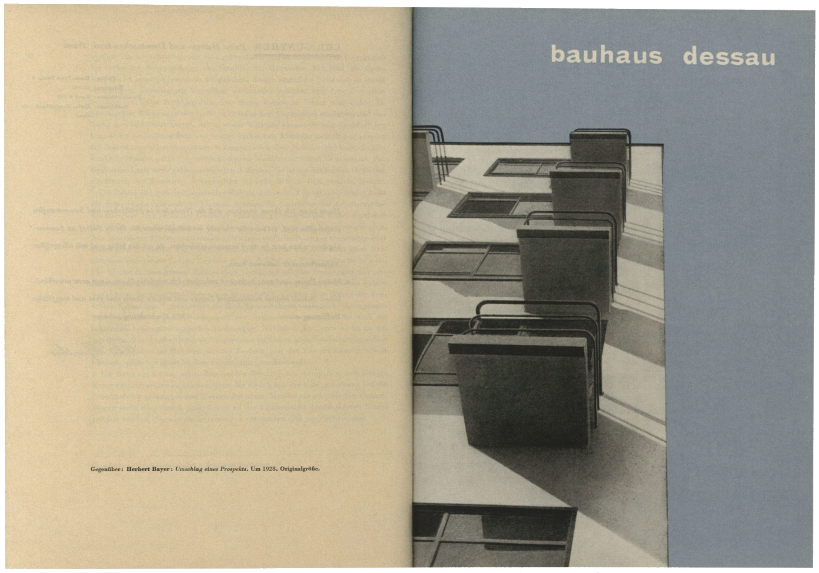
Jan Tschichold. Internal spread of Typographische Gestaltung, Benno Schwabe & Co., Basel, 1935
Something about Book Design: Jan Tschichold
Since the end of artistic development along traditional paths, that is, since the 1870s, one must always remember that the book should be envisioned as a unity of type, image, title, binding, paper, and so forth. The danger of neglecting this requirement has never been so strong as today. Yet, to tell the truth, today only the most important books are artistic unities. Even large publishing houses with a tradition entrust the individual parts of book production to specialists who work in isolation and carry out their own tasks very well but seldom have an inkling of the total appearance of the final book. When the publisher has no manufacturer of his own, he leaves it up to the contracted printing house to decide on suggestions for type, line length, line spacing, and so forth. The book is then produced. The most the publisher does with the title is to correct or just sketch it because every element determines the style of the book and only the publisher (and not always) knows how the book should eventually look. Aside from this, a binding designer is working on plans for the back and front of the book. The dust jacket often comes from a third artist. This division of tasks with no real artistic supervision, in which complete sections of the book are entrusted to different persons with greater or, for the most part, lesser artistic imagination, can lead to the situation in which the pages of the book with their type, line spacing, page layout, decorations, and so forth, come from compositor A, perhaps initials from artist B, while Miss C is engaged to do vital things "to beautify the book."
So as not to lose the contract and to justify the highest possible payment (which is urgently needed), one person uses ornament and embellished letters - unfortunately, completely different from Miss C's initials. Since D does not know that the book is being set in French Antiqua type, he unhesitatingly designs a script in medieval style or any other kind. At the same time, the commission for binding design is handed over to another artist, Mr. E, a specialist in baroque-style bindings. He knows neither that compositor A is using baroque-style ornaments by B and cast initials by Miss C, nor that his rival, designer D, has planned a richly "embellished" inner title. He adopts a neutral character for the interior setup of the book and carries out his task by tastefully exploiting a handy antiquarian catalog of "bindings in princely possession." Unfortunately, he provides a red' covering, not knowing that D has chosen brown as the second color of the title. The manager at the publishing house respects the "artistic opinions" of D and E and forgets to consider that vermilion and brown clash. One can easily imagine the outcome. Even if the individual work done by A, B, C, D, and E is, in itself, flawless, lacking any unifying supervision, the outcome must be frightful. The book is no longer a unity; it is not even a conglomeration; it is a rubble heap. If the publisher now needs a colorful illustrated dust jacket (fortunately, seldom the case) he turns to the famous designer F, "the Master of Risque Female Forms." Then we finally have six persons "collaborating" on the book, simply because the manager of the publishing house, despite his efforts to achieve the best, is a businessman who does not know how to use the available talents correctly, that is, properly integrating them. (This ironic account is not gratuitously invented, but is a true occurrence, one among many!)
The next task for the publisher-producer (in the widest sense), who is responsible for every eventuality, consists in eliminating this lack of planning in book production. The publisher should preferably commission the total design of book number I from Mr. D, book number II from Mr. E, and book number III from Mr. A, the compositor (assuming that D and E know enough about typography and that A is proficient in design). Then the choice of type, line spacing, the placement of type-areas, the designation of sections of the book, the titling, the binding design, and if possible, the design for the dust jacket must be entrusted to a single person, if a unity is to be produced. Unfortunately, graphic artists D and E are very unproficient in the ways of the compositor, and compositors who are able to completely design a book are few and far between. Here there are just two approaches: the businessman-publisher employs an artistically cultivated manufacturer who supervises the production of the book and, when he entrusts an artist with the design of the binding, he also takes care that the parts harmonize well. Or one may search out a designer who has more than a vague idea about composition (type, line spacing, calculations) as well as about matters concerning binding-design. The latter then provides the total plan for the book, from the layout of the pages to the binding. Today there are few who could master such a task; for the most part, they are typographers because the book is always composed of type, which is the foundation of all book design.
To what should one pay particular attention in designing the book as a unified whole? To simple "little things." The page should not have a medieval character if the book is set in French Antiqua type. At best one uses the basic type in the same or a smaller size, perhaps even in its cursive form. Only when the page number is genuinely important is it set in large size. If the chapter titles are set in Grotesque, one can repeat this on the page. An emphatic marking of chapter titles then is proper only when the content admits it: one cannot, for instance, set the words "Third Chapter" four degrees larger than the basic type size in thick Grotesque. It is another thing when titles make a genuine orientation possible. Initials are not fashionable. Their most bearable form is the large capital letter, standing more than two lines high. More modern is the capital letter standing out from the line that is the next size larger than the basic type or one size larger still (with a squared-indentation for the section if the beginning is to be indicated by such an indentation). Or one uses no initials and emphasizes the title or the chapter number. Blank space above the beginning of chapters is often an unusually good idea. Any obtrusiveness caused by arbitrary typography is to be strictly avoided. Nevertheless banal design is also a flaw. Through the choice of typeface (here classical Antiqua type, particularly the "French" style such as Didot or Bodoni or something similar is preferable), the typographer can shape the appearance of each book by using a script that suits the content of the book. I consider it crucial that the selected type (almost always a cast type) be used not only for chapter titles and, it goes without saying, for the book's title, but it should also be used for the binding. That may be new, but only in this way can one avoid loud clashes between the design of the binding and that of the book. The size of type and the format in which it is arranged are matters of taste, about which one can scarcely write in this limited space. Illustrations can give a better view than long theories. Of great importance is the arrangement of the page following the title page, which should always be considered since it is opposite the opening page. This page is almost always badly neglected because one does not always realize how strong an impact these two pages have on the graphic impression of the book.
The dust jacket can also be produced through purely typographical means. Two different colors of ink on tinted paper can produce a good impression. The task of a dust jacket is admittedly very different from that of the binding; the latter is an enduring cover of neutral expression whereas the former resembles a poster, and not just in being ephemeral. For that reason one uses large letters differently laid out for the dust jacket. Of course, the book should be harmonious in terms of color as well as graphically. Colors also are appropriate for the top edge of the cut pages (one would do better not to color the other sides of the cut pages). Restraint, the use of pale, unobtrusive, yellowish tones, is preferable here to loud colors.
Perhaps many of these sentences suggest "carrying coals to Newcastle." But the real world all too frequently refutes the opinion that their repetition is superfluous. Revolutions are not to be expected in the various parts of book production, but rather constant modifications. Those who are striving for better results should not forget that the little we can do should be done as well as possible.
Design Issues, Vol. IX, Number 2, Spring 1993, MIT Press, Cambridge, Massachusetts. pp. 77–79